
Home > Presentation of Data Page> Conditional formatting of Charts
Discover the magic of conditional formatting in PowerPoint charts. Add more insights to your charts and make your business message memorable.
What is conditional formatting of charts?
Your data charts need not be plain and boring. You can apply different formatting styles for different elements in your chart based on the conditions predefined by you. In this article, we will explore some interesting applications of conditional formatting to make your data presentations memorable.
Note: All the data driven chart templates you see in this article are taken from our Visual PowerPoint Graphs Pack. The pack has more than 320 business relevant graph templates that are super easy to use. You can save lots of time constructing and polishing your charts by using our pre-formatted chart templates.
How to Set Up Conditional Formatting in PowerPoint
Now that you know how to create the conditional formatting, let’s see all the various uses of this type of formatting:
Highlighting Highest & Lowest values in a data series
There are times when your chart has data series with lots of data points. It becomes quite difficult for your audience to find the highest and lowest values in the series. A quick application of conditional formatting solves the issue. Take a look at the following template for example:
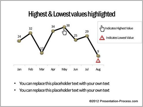 Your audience can quickly locate the significant points without having to search all over the chart. You can even format your chart in such a way that the highest values are automatically highlighted even among multiple data series. For example, take a look at the following chart template:
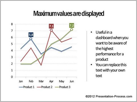
Source: Minimum Maximum Values from Graphs Pack
The formatting automatically shows data label for the highest number in the series.
Related: Using Box Whisker Plots to show series range
Formatting labels in the Axes
Most presenters assume that they can apply conditional formatting of charts only to the lines or columns in a chart. The fact is – you can apply conditional formatting to just about any element you want in a chart. For example, in the following chart template we applied conditional formatting to labels in the X-axis.

The months automatically change font color when the performance values are below target.
You can take conditional formatting of charts to the next level by changing the position of axis labels based on whether the values are positive or negative. Take a look at the following template for example:

Source: Bar charts from Visual PowerPoint Graphs Pack
In the above chart template – ‘Jan’ is shown on the left of the bar and ‘Feb’ is shown on the right of the bar because ‘Jan’ has positive performance value and ‘Feb’ has negative value.
Formatting the markers
You can apply conditional formatting to show different markers based on your predefined condition. For example, take a look at the following Conditional chart template showing Winners and Underachievers:

The chart automatically shows values above the target with ‘Thumbs up’ icon and values below the target with ‘Thumbs down’ icon.
The context you add to your numbers is limited only by your imagination. For example, in the following chart template we used different ‘smiley figures’ to show values above and below target value:
![]()
Related: Creative Info graphics Examples for PowerPoint
You can even make changes to your chart background and come with some interesting variations. For example, in the following chart template we used a ‘White board’ background for the chart and used different types of board magnets to show performance above and below target:

Source: Winners and Underachievers from Graphs Pack
Inference:
What you saw are just a few ideas to inspire your creativity. You can come up with your own variations to these conditional formatting of charts by applying a bit of imagination and application.
If you are a busy business presenter who can’t invest the time it requires to create such insightful charts, we recommend you take a look at our ‘Visual PowerPoint Graphs Pack’. The pack has a wide variety of preformatted chart templates to save you loads of time in constructing and formatting your charts. Take a look at this demo page to see how easy it is use our chart templates.
 Why waste time creating your charts from the scratch when you have such a high quality solution available off the shelf?