Home > Presentation of Data Page> Data Presentation
Make your presentations with data more insightful. Discover five creative ways to add more value to your basic line and bar charts.
Mindset of your audience in a Data Presentation:
People have different mindset when reading a performance report and when attending a data oriented business presentations.
While reading a performance report, people are detail conscious. They have the time to ‘think’ and make their own conclusions from the numbers presented to them. So in a report, individual data points have significance.
While attending a business presentation, audience is decision oriented. They are not as interested in the numbers, as they are about the inferences made from those numbers. So in a business presentation, the way you process and present the data is more important.
Many business presenters fail to realize this key difference. They treat a business presentation the same way as they treat a performance report and end up losing their audience. In this article, we will see some simple ideas to add value to your basic line and bar charts.
1. Indicate minimum & maximum values in a data series
Sometimes, when you present performance values for a long series, your audience may get overwhelmed.
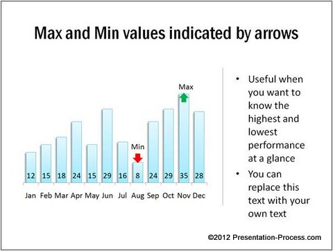
It helps to highlight significant numbers to make it easy for them to process your data in their mind. Instead of showing just a plain column chart, you can indicate minimum and maximum values in your data presentation as follows:

Source: Min Max Values Charts from Visual Graphs Pack
This helps your audience get a better perspective of the numbers, especially when the data shows wide variance.
Examples of presentations where this may be useful: Showing manufacturing output over a period of time, change in temperatures or rainfall over time etc.
Related: Make Your Performance Graph Templates Memorable
2. Indicate Average line to give context to bar chart
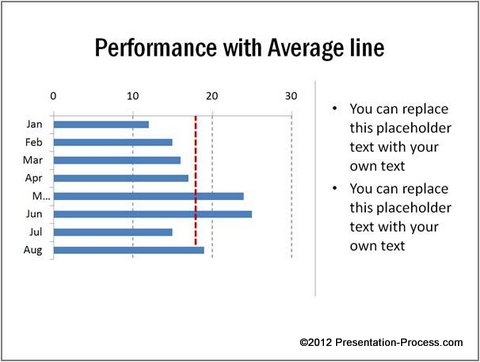
Here is a bar chart that shows performance over months. By adding a line that indicates average value, audience gets a quick perspective of months that pull up the average and the months that drag.

Source: Conditional Charts from Visual PowerPoint Graphs Pack
Examples: Data Presentation about sales performance by a team, marks scored in a test, the quality of customer service over time etc.
3. Indicate months with value less than median
Here is another way to help audience quickly identify under-performing months. When you use median instead of average, you don’t have to worry about outliers skewing the perspective.
 Examples: This can be used for presentations showing sales at an outlet over time, performance by an employee over the years, average ratings provided by customers over time etc.
4. Indicate performance before & after event
Take a look at the following chart template:
 If there is a significant event that has impacted performance over the given period, it helps to visually indicate the point as shown in the chart above.
Example: Sales before and after an expo, change in staff turnover before and after a HR change etc. can be shown with this kind of graph, output before and after procuring an additional machine etc.
5. Highlight spikes and dips to provide explanation
Take a look at the following way to represent information in a data presentation:
 Source: Performance Before and After Event from Graphs Pack
When you present your performance over time, you may see sudden spikes or dips in performance. Highlighting those periods helps you explain your reasons proactively.
Business Example: Data Presentation about change in number of walk-ins when advertisement was run online, impact on number of incoming calls due to an event etc.
Inference:
What you saw are just a few ways you can add value to your plain line and bar charts. These charts not only make your charts interesting, but also make your message memorable.
Caveat: While value added charts make your presentation memorable, they take time and skill to create them from the scratch.
If you are a business presenter hard pressed for time, we have an elegant solution to help you overcome the issue. We are happy to present our ‘Visual PowerPoint Graphs pack’. The pack has more than 320 business relevant, preformatted PowerPoint chart templates to help you visualize any information you need.
The chart templates are super easy to use. Take a look at the demo to see how easy it is to edit data in our chart templates.
Why waste time constructing your data charts from the scratch, when you have such a high quality solution available off the shelf?
Related: 5 Exciting Line Chart Templates in PowerPoint
Return to Top of Data Presentation Insightful Page
