
Home > Presentation Tips > Death by PowerPoint
Death by PowerPoint – what is it?
It is an occupational hazard every executive goes through in the meeting rooms. In a typical event, the killer (err… the presenter) walks into the room carrying slides loaded with bullets and fires at the unsuspecting audience till they die.
Some presenters with a more sadistic streak bayonet the moving bodies with complex graphs and charts.
Why do presenters kill with bullet points?
There is just one root cause for all evils related to PowerPoint usage. It is:
Slides serve presenters instead of the audience.
Every possible issue related to boredom and complexity of slides stems from this single cause. There are 3 common ways in which the problem manifests. Let’s see them one by one.
Problem 1: Using PowerPoint slides as Teleprompters
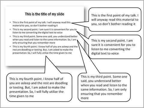
A typical Teleprompter slide looks like this:
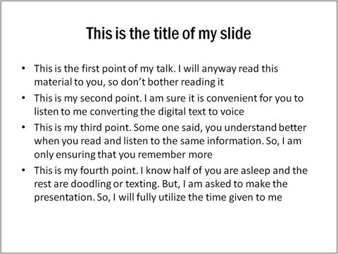
The biggest convenience is – you can be as lazy as a sloth and get away with it. You don’t have to waste even one minute in preparation.
Just delegate the chore of slide preparation to a junior executive and pick up your file on your way to the meeting room. Then you just stand there and read the slides.
The bonus is – you can conveniently turn your back to the audience and ignore the tears of boredom running down their face.
The 3 main problems with the teleprompter method are:
- Your voice disturbs the audience who are busy reading your slides. So, you are better off emailing your slides than delivering them in the meeting room
- Since your audience can read faster than you, they switch off once they read your slides
- You lose your audience after your first slide
Let’s see the second way that slides are abused.
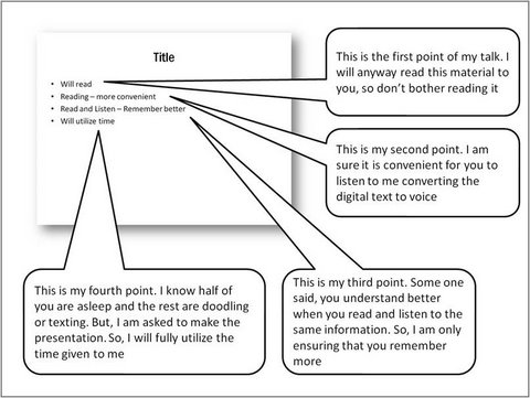
Problem 2: Using slides as cue cards
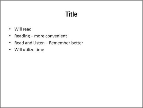
Though the prattle to explain the points remains the same, the text in the slide is reduced to a couple of words per bullet point. This is slightly better than the teleprompter method.
Since the audience can’t make head or tail out of the words written on the slide, they have to rely on you to unravel the mystery. The success of your presentation depends on how well you talk through the cues.
The 3 problems with the Cue Card method are:
- There is no visual cue available for your audience to retain your information. So, your audience will soon forget your message
- Since words on the slide serve only to jog your memory, you are better off switching off the projector and carry the cue cards in your hands
- Presentation can sound quite monotonous after a few minutes and lead to the dreaded death by powerpoint.
Let’s see the final abuse of PowerPoint slides…
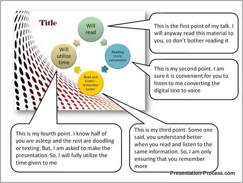
Problem 3: Using slides as fancy cue cards after paying a design firm
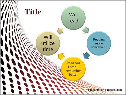
Though this looks like a very clever depiction of your ideas, it is nothing more than the cue card mentioned earlier. The visual looks like a diagram, but it is not. Your design studio expert did nothing more than putting your cues on a fancy smart art and inserting a stylish background.
Please don’t get us wrong. We strongly recommend using diagrams to represent your ideas. But, don’t use ‘diagram like objects’ to trick your audience into biting your bullet points.
Later, when you do want to use genuine PowerPoint diagrams, you won’t get your audience attention.
We also support the use of good professional presentation backgrounds. But, they are apt for your title slides, section headers and thank you slides rather than your content slides.
Such content slides, despite a more polished look – still lead to death by PowerPoint.
The 3 problems with the Fancy Cue Cards method are:
- Your audience expects an explanation for the diagram. When you can’t justify the diagram, and use the usual prattle to explain your slide, you disappoint them
- Though the slide looks colorful, there are no visual cues for your audience to serve as a memory hook to enhance retention
- The money you paid the designer is not justified
So, what is the solution to the problem of Death by PowerPoint?
The answer is:
Use slides to serve your audience and not you.
When you follow this simple advice, you will start using diagrams to communicate your ideas in a simple way. You will use meaningful visuals to add depth to your message. Your slides will support your engagement with your audience.
It can be learnt easily, and it will make a world of difference to your presentations. Click here to learn why you need to use PowerPoint diagrams.
Return to Main Presentation Tips Page