Home > PowerPoint Slides Principle of design balance
Learn the principle of Design balance to make your PowerPoint slides look harmonious and professional. See multiple examples of presentations with and without this principle.
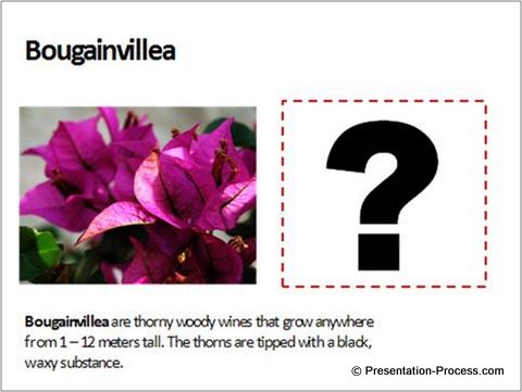
Compare the two slides here:
PowerPoint slide design example 1

Slide Design Example 2:

Take a moment to reflect on the way the two slides made you feel. Did you find that the second slide was more stable and more appealing than the first one?
You just witnessed the power of Visual Balance in slide layout.
Here is the reason why you felt the difference:
When you saw the first slide where all the elements were left aligned, your mind started expecting some more elements to fill the unexplained white space on the right. When that didn’t happen, you felt visual tension.

In the second slide, the elements were evenly balanced out and you got a sense of comfort.
Note: You can create the visual tension intentionally with custom animation to engage audiences. But there is no second point in this particular slide.
We are wired to seek equilibrium in any design. That is why, when you apply the principle of Visual Balance in your slides, your slides look harmonious and clear.
Here is a simple way to understand the principle of Design Balance:
Imagine a weighing balance or scale placed on your slide.

Every visual element adds certain weight on the slide. Unless the weights are balanced properly, your slide creates visual tension in your audience’s mind.
But, there is a trick.
You can’t create harmony and balance by merely spreading the elements all over the slide. You may end up overwhelming the mind with unconnected pieces. You need to first group the related elements on the slide as visual chunks before you place them in balance.
What is a visual chunk?
Visual chunking is nothing but a related set of elements on a slide. A visual chunk could be a block of text or an image or a set of design components on a slide. For example, take a look at the following slide:

There are three visual chunks marked by red circles.
Even though the picture at the bottom right is made of different components like fruit basket, fruits and a glass of fruit juice, they are taken as one visual chunk because the components are related to each other.
The same way, the two chevrons are taken as one visual chunk because they are connected in their characteristics.
The weight of a visual chunk
Not all visual chunks carry equal weight. The weight depends on the space occupied by the chunk and the intensity of the colors used. There is no fixed formula to distribute them on your slides. Just try different options till you feel the right design balance.
Strive for asymmetrical balance:
The easiest option to balance the chunks is to center align everything. But, the result is a boring slide like the one you see here:

If you spend a little time distributing the visual chunks asymmetrically, your slides look dynamic and they keep the attention of your audience on the slide:

Creating harmonious slides takes practice and conscious effort. You can learn a lot by carefully studying popular presentations from sites like Slideshare.
Even if you are too busy to learn the principles, you don’t need to worry. You can take advantage of some high quality templates available on the net. One of our most popular templates set is the PowerPoint Charts and Diagrams CEO Pack. A pack with 750+ different ready to use templates on a range of topics for business presentations.
[su_button url=”https://www.presentation-process.com/powerpoint-charts-diagrams-ceo.html” style=”flat” background=”#3498db” color=”#ffffff” size=”7″ wide=”yes” center=”yes” radius=”5″ icon=”icon: check-square-o”]Click Here to Browse Templates from CEO Pack[/su_button]

