
Home > Presentation of Data Page>Doughnut Chart
Discover creative ways to use a PowerPoint Doughnut. Find info graphic ideas that make your data slides look interesting and memorable.
Discovering uses of a Doughnut chart:
Donut charts are not used as commonly as pie charts in business presentations. When properly formatted doughnut charts look visually interesting. Take a look at the following examples:

Here is a template that uses exploded donut chart:

In this article, we will see some creative ways to use doughnuts that go beyond expressing just percentage composition.

Note: All the data driven templates you see in this article are taken from our Visual PowerPoint Graphs pack.
The templates are quite easy to edit. You just need to replace sample data with your own data in the embedded worksheet. The charts update themselves automatically. Using professionally designed templates is arguably the most efficient way to create stunning data presentation in minutes.
Browse through the Graphs Pack Here

1.Creating performance dials:
Doughnuts are quite handy to indicate percentage completion in project management dashboards. Take a look at the following example:

Source: Percentage Completion Dials from Visual Graphs Pack
The space in the centre of doughnuts is useful to indicate data labels clearly.
2.Using doughnuts in conjunction with images:
The unique shape of donuts allows you to include circular images in the center to set context to your business message. For example, take a look at the following marketing template that compares market share of a brand in world market and local market.
![]()
Related: Creating Expressive Business Icons
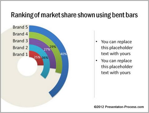
3.Doughnuts as bent bars:
Do you know that you can create multiple donuts by adding additional data series?

PowerPoint allows you to enter single series of data in their default donut template. You can add additional data series to create multiple donuts. This allows you to design bent bars that compare data points both for their ranks and for their percentage completion. For example, take a look at the following Doughnut chart template:
4.Bent bars on a clock dial:
You can take the bent bars to the next level by adding a clock dial in the background. This helps you to add an additional perspective of time. Here is an example Bent Bar Doughnut template:

Source: Percentage Completion Dials from Visual Graphs Pack
Inference:
If you want to make your message memorable, don’t settle for the ‘usual’ look and feel for your slide deck. With a bit of imagination you can use doughnuts to create remarkable data slides for your business presentations.
Caveat: Creating high quality data charts takes a lot of time and effort. Most business presenters don’t have the time to create such slides. That is why they ‘settle’ for mediocre slides.
If you are a busy business presenter, who wants your data slides to stand out, we have an elegant solution for you. We recommend you take a look at our ‘Visual PowerPoint Graphs Pack’. The pack has more than 320 business relevant, data driven charts and info graphic templates created in PowerPoint. In fact, all the templates you saw in this article are from the pack.
Here is another Creative Doughnut and Pie Chart Example from the pack

The templates are super easy to use. Take a look at this demo page to see the ease of use of our templates.
Why waste time creating your charts from the scratch, when you have such a high quality solution available off the shelf?
Related: Designer Pie Chart Tutorial