
Home > All PowerPoint Tutorials > Infographics> Hand Drawn Charts
Discover a simple trick to create hand drawn data-driven charts in PowerPoint. Design engaging slides that make your presentation memorable.
A quick word about hand drawn charts:
Have you observed that slides with hand drawn sketches instantly give the feeling of informality to your presentations?
The ‘human touch’ in the visuals encourages audience to let their guards down. That is probably why hand drawn slides are so often used in presentations where audience needs to engage in the ideation process.
It is easy to sketch a few basic icons using scribble tools in auto shapes menu. However, it is not possible to create data driven charts using the same method. In this article, we will share with you a simple trick to help you create scribble style data driven charts in PowerPoint easily.
Step 1: Create the base chart
Go to Insert -> Chart option to create a chart of your choice.
In this case, we added a simple column chart and populated it with some data.

Step 2: Draw a hand drawn image
Create a hand drawn image using scribble tool in auto shapes menu

![]()
In this case, we are using this simple scribbled arrow for use in this tutorial. You can create any scribble based on your product, type of presentation etc.
Step 3: Paste the hand drawn image
Now ‘copy’ the hand drawn image using ‘Ctrl+C’ option. This copies the image to the clip board. Click on the columns and press ‘Ctrl+V’.
Ensure that all columns are selected so your image gets inserted into them all at the same time.
You can click on the gridlines and delete them. You can add data labels to the columns. You can change the default font to any hand drawn styled font. The result will be as follows:

It is that simple to create hand drawn graphs in PowerPoint. You can use the technique to spice up any of your basic data driven charts in your business presentations.
If you want to use more detailed hand drawn graphs, we have an elegant solution for you.
Easier option for business presenters:
It takes a lot of time and effort to create data driven charts that are stylish and elegant. Most business presenters don’t have the time to create such visually interesting charts. That is why we came up with our Visual PowerPoint Graphs Pack. The pack has more than 320 business relevant data driven PowerPoint chart templates that are super easy to use.
Here are some samples from the pack, where we have tried to take hand drawn graph templates to a whole new level:
Examples of hand drawn chart templates in PowerPoint:
Here are some hand drawn charts with conditional formatting.

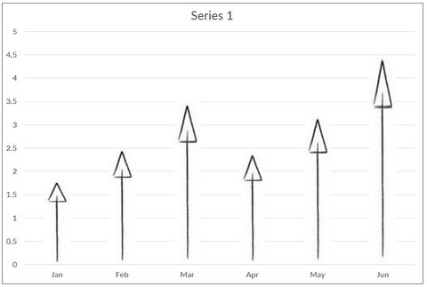
Here we applied scribble fill effect to the arrows in the chart:


Source: Handdrawn Data driven Charts from Graphs Pack
In the following template, you just need to replace sample data with your own data. The chart updates itself with the new values and the max, min values are automatically indicated.
Data-driven scribble graph showing Min Max Values:

Related: Ideas to make Data Presentations Insightful
Here is a hand drawn bubble chart template:

Here is a hand drawn pie chart with scribble fill:


You can see more examples of hand drawn templates here.
Application of hand drawn charts:
You can use the templates when the look and feel of charts is important. For example, you can the charts in:
- Newsletters and internal magazines
- Web pages
- E-learning modules etc.
Why settle for mediocre charts that take a long time to construct from the scratch, when you have such an elegant solution in the form of ‘Visual PowerPoint Graphs Pack’ available off the shelf?
Related: PowerPoint Tutorial To Create Hand drawn Diagrams