Graphs Showing Performance Comparison Across 2 Periods

Part of : 320+ Visual PowerPoint Graphs Pack

Widest Variety of Data-Driven Graphs & Infographics for PowerPoint

Performance Compared Across 2 Years – Quarter on Quarter
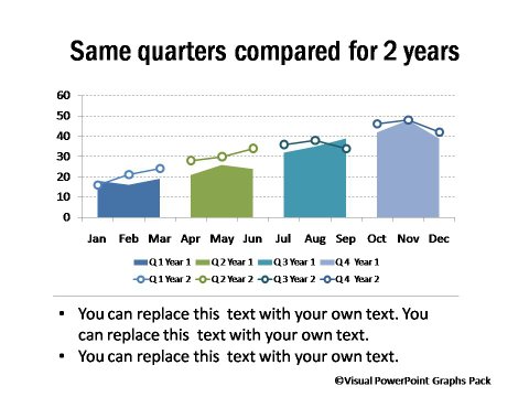
Comparison Across 2 Periods

Description: A range of simple and visual charts to help you compare performance or data of any 2 periods. Includes the easy to understand Bump Charts.

Bump Chart Showing Change in Ranking
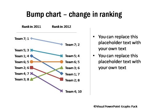
Bump Chart Showing Change in Ranking

Flying Arrows Showing Change in Performance
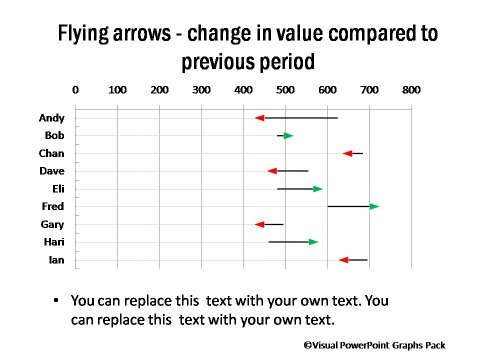
Flying Arrows Showing Change in Performance

Circles and Lines Showing Change in Revenue Over 2 Periods
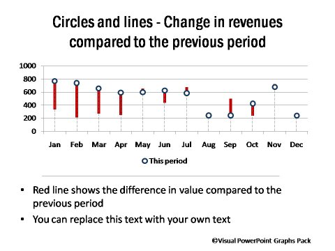
Circles and Lines Comparing Previous Performance

Editable PowerPoint Graph showing Month to Month Comparison Across 2 Years
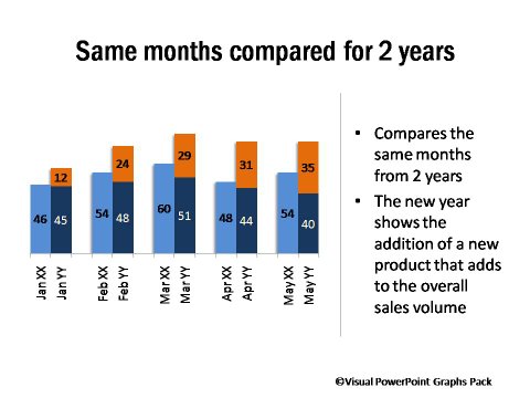
PowerPoint graph showing Month to Month Comparison Across 2 Years

Change  in Market Share Compared as Stacked Boxes
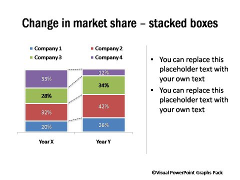
Market Share Change Comparison

Change in Percentage Market Share Compared
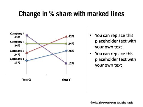
Change in Percentage Market Share Compared

Change in Share over Time – Compared
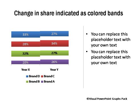
Change in Share over Time - Compared

Change in Share over Time – Sliding Boxes
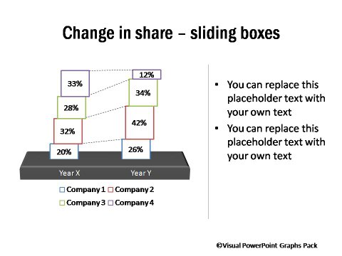
Change in Share over Time - Sliding Boxes

Related Templates from Graphs Pack:

Performance Comparison across Quarters

Performance Across Quarters

Comparison of performance Before & After Event

Highlighting an Event Period

NEXT STEPS:

Go to Gallery of Visual PowerPoint PackView Demo of Visual Graphs PackPricing of Graphs Pack


Share these tips & tutorials

Get 25 Creative PowerPoint Ideas Mini Course &
 Members-only tips & offers. Sign up for free below: