Graphs Showing Performance Comparison Across Products

Part of : 320+ Visual PowerPoint Graphs Pack

Widest Variety of Data-Driven Graphs & Infographics for PowerPoint

Jaws Chart Showing Performance Comparison Across Products
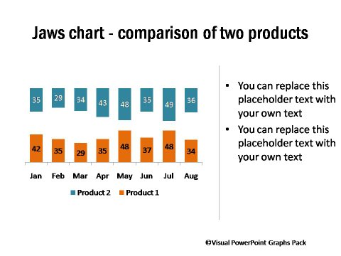
Jaws Chart Showing Performance Comparison Across Products

Description:  These graphs can be used to compare performance of products ( or brands) across periods (or regions). They are useful in dashboards to provide quick visual clues to your audience and help you get across your ideas across powerfully.

Performance Comparison with Plus Minus Gaps
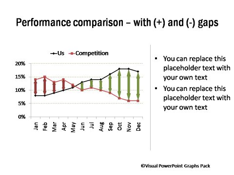
Performance Comparison with Plus Minus Gaps

2 Product Comparison with Bar Charts
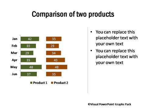
2 Product Comparison with Bar Charts

Mosaic Chart Comparing Brand Performance Across Regions
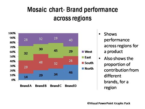
Mosaic Chart Comparing Brand Performance Across Regions

Quilt Chart Showing Regional Performance Across Brands
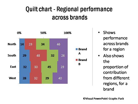
Quilt Chart Showing Regional Performance Across Brands

Product Comparison Chart with Series Lines
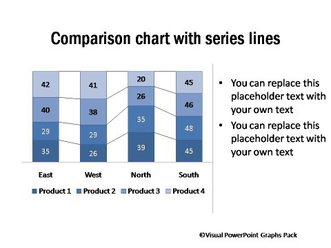
Comparison Chart with Series Lines

Related Templates from Graphs Pack:

Performance Compared To Target

Performance Against Targets

Charts with Performance Gap Highlighted

Performance Comparison with Plus Minus Gaps

NEXT STEPS:

Go to Gallery of Visual PowerPoint PackView Demo of Visual Graphs PackPricing of Graphs Pack

Share these tips & tutorials

Get 25 Creative PowerPoint Ideas Mini Course &
 Members-only tips & offers. Sign up for free below: