Home > All 2010 2007 Tutorials > Infographics> Pie Chart in PowerPoint
Find practical solutions for the three big issues in using Pie charts in a presentation. See how you can get the best out this chart type.
Pie chart in PowerPoint – to use or not:
Pie chart is not seen as an effective data visualization tool by many presenters. There are some strong arguments that justify the view. In this article, we will see some of the reasons that make pie charts less favorable and find ways to overcome the issues.
Issue 1: Angles are harder to judge than lengths
Many purists believe in using bar charts than pie charts. The reason is – it is harder to judge angles than lengths.
While there is merit in the argument, we believe that a pie chart shows proportions much better than bar charts. Since ‘pie’ is a simple visual metaphor, it is easily understood by the audience.
To solve the confusion with the angles, make it a habit to…
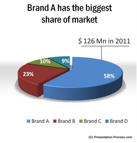
Use data labels whenever you use pie charts

Source: Pie Charts from Visual PowerPoint Graphs pack
Your audiences don’t have to guess the angles anymore and your message comes through clearly.
Related: PowerPoint Charts and Graphs: 2 Rules for Clarity
Issue 2: Pie chart fails when data points are more
When you want to show a lot of data points, the pie chart gets really messy. The segments are so fine that it is hard to determine the proportions correctly.
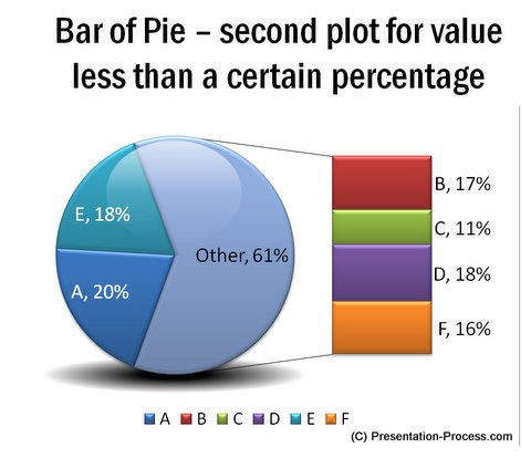
When you have a lot of data points to show, it helps to break the pie chart into two levels and show the details in incremental steps. Take a look at this example:

Source: Pie Charts with Details from Graphs Pack
Use ‘Bar of Pie’ or ‘Pie of Pie’ chart types to visualize your data.
Remember, you would be showing your chart in a PowerPoint presentation and not in an excel report. You want to ‘make a point’ with your chart, than to show the chart and let the audience do the thinking.
Follow this useful thumb rule when presenting large data using pie charts:
When your pie chart in PowerPoint has more than 6 segments, break it up.
To help your audience understand your chart even better – use custom animation to present your chart in stages.
Issue 3: Information shown in 3D pie charts look manipulated
If angles are difficult to judge in a chart, 3D makes the issue even worse.
But, when you have a limited number of data points, clearly labeled values and explicit inference shown in the title – 3D pie charts make their point fairly well.
 Caution: Ensure that the colors of the segments have sufficient contrast. Limit the angle of rotation to the point where all the segments are clearly visible without distortion.
You may use 3D charts sparingly in a presentation for their visual appeal. But, it is advisable never to use 3D charts in detailed reports.
Data driven chart templates for PowerPoint:
If you are a business presenter, we urge you to take a look at our ‘Visual PowerPoint graphs pack’. The pie chart in PowerPoint and other graphs showcased in this article are from this pack. There are more than 320 highly insightful data driven chart templates in the pack, to help you present your data with impact.
The charts in the pack are pre-formatted and are super easy to use. Just replace the sample data with your own data and your slides get ready in minutes. Please browse through our collection and see how the pack can change the way you create data presentations forever.
If you liked this article, please leave a comment below. You can also share it with your friends…
Related:How to create Designer PowerPoint Pie Chart
Related: Using Box Whisker Plot in PowerPoint
