Home > Presentation of Data Page > Pie Chart in PowerPoint
Discover 3 ways to improve the design of your pie chart. Follow these ideas to grab and retain your audience attention.
Who says Pie chart in PowerPoint should be boring?
Most of us don’t go beyond the boring ‘default’ pie chart option in PowerPoint for our business presentations. This naturally triggers the – ‘I’ve seen this before’ button in our audience’s mind. So, we lose our audience’s attention at “Hello”, even without us realizing it.
Here are 3 simple ideas to make your pie charts come to life in a board room.
Related: Light Up your Board Room with Humor
1.Avoid the ‘serial actor syndrome’:
Some popular television stars act in multiple television serials at the same time. So, sometimes audience finds it difficult to remember which serial they are watching and what the plot is, when they see a particular actor on screen.
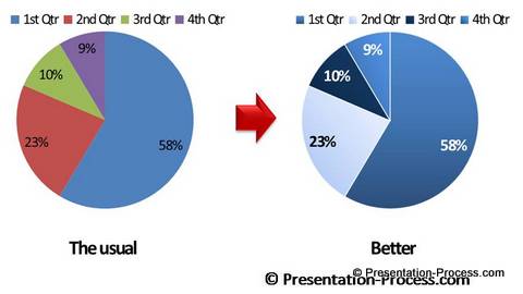
The same phenomenon happens in boardrooms too. When presenters use ‘default’ color scheme in their charts, the same red, blue, green and purple colors represent different things in different presentations. The charts begin to look the same and the audience gets bored.
You can avoid this problem with a simple idea. Stop using the default color scheme and use a unique color scheme for your charts. See the difference it makes in the following example:

2.Use Data labels for your 3D Pie charts
Most 3D charts look very impressive. They make your audience sit up and notice your slides. But by nature, 3D perspective distorts the proportions of your chart. It is not easy for your audience to guess the proportions of different segments in the pie chart accurately.
How to solve the problem?
Use relevant data labels for all your 3D Piecharts. Here is a designer 3D pie chart in PowerPoint from our ‘750 + PowerPoint Charts and Diagrams pack for CEOs’. The clear data labels make it easy for the audience to read the proportions accurately.

Source: PowerPoint Pie charts from CEO Pack
3.Use clear callouts where relevant
Many presenters keep charts separate from their associated explanation. So, audience finds it difficult to relate to the logic of the presenter easily.
It always helps to comment on relevant portions of a chart using a clear callout. Take a look at this chart template from the CEO Pack for example:

Related: 3 Creative Ideas for a Data Presentation
Inference About Using Pie Chart in PowerPoint:
PowerPoint 2007 and 2010 offer a number of useful options to make your charts look beautiful and meaningful. All you need is that ‘little extra imagination’ to make your charts clear and intuitive.
In this site, we have lots of interesting articles to help you improve the effectiveness of your data presentation. If you don’t have the time to create professional charts, we recommend you take a look at our ‘750 + PowerPoint Charts and Diagram templates pack for CEOs’. The pack has more than 750 ready made and fully editable templates to make life easy for a business presenter like you.
Here are some PowerPoint pie charts from the pack for your evaluation:
Data-Driven Segmented Pie charts
 |  |
3d PowerPoint Pie Chart | Glossy Pie Chart
 |  |
Why waste time creating charts from the scratch, when you can use our readymade solution and leave a lasting impression on your business audience?
See More Charts & Graphs from PowerPoint CEO Pack here>>
Related Ideas – Tell a Story with Your Graphs
Related: Create Designer Pie Charts
Please select what you would like to do…
Return to Top of Pie Chart in PowerPoint Page
