Home > Presentation Design > PowerPoint Designer Best Practices
If you design PowerPoint, here are 5 best practices of web design you can use to enhance your PowerPoint slide design.
Best Design Practices for PowerPoint Designers
As those who frequently design PowerPoint slides, we keep a constant watch on the best design practices from various fields to enhance our slide design.
We covered the 7 essential differences in Print design and PowerPoint slide design in a previous article. In this article, we will show you some useful practices you can adopt from the field of web designing.
1.Build a wire frame before you fill the content
A good web designer would never build the site content before fully visualizing the end result. Every element of the site structure is carefully sketched on paper as ‘wire frames’ before their fingers reach for a keyboard.

This practice serves well when you design your PowerPoint presentations too. Never touch your computer till you finalize your presentation outline. Or you may run the risk of creating content that lacks a compelling story and a seamless flow.
Read: How to create a presentation story that flows
2. Make a professional first impression with a header
Web designers spend a lot of time and effort to make a professional impression with the header on the homepage. They realize that the impression made in the first few seconds determines whether a visitor continues browsing the site or ditches it for good. If the header is dull and boring, the visitor tends to assume that the site is boring too.

For example, take a look at the Home page of a site that sells PowerPoint templates for business presenters.
In the first few seconds the site needs to make an impression on the visitor about the quality of its offering and the wide range of templates. The site uses an interesting header to achieve the objective.
In your PowerPoint presentations, the title slide is like the header of the site. If the first slide that you project on the screen looks lifeless, the audience tends to lose interest in the rest of the content.
So, spend some time and effort to ensure that your opening slide reflects your thinking, your brand and the quality you represent.
Here is an example of a powerful title slide that makes a professional impression.
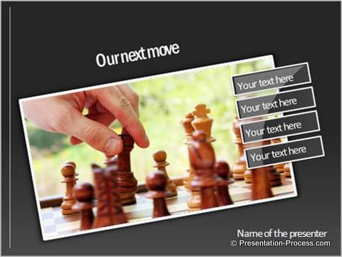
Source: Agenda Slides for PowerPoint Charts & Diagrams CEO Pack
3. Show them what to expect through your menu
If you visit a well-designed website, you will know what to expect from the site by looking at the navigation buttons. Web designers organize their site’s content into meaningful clusters and title them appropriately to help you get an understanding of the site content.
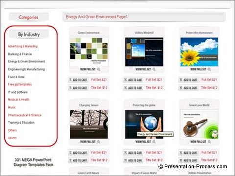
In a PowerPoint presentation, your agenda slide serves as the navigation bar. Organize your presentation content into logical clusters and give a quick overview of your presentation through well thought out agenda points.
Resource: 5 Creative Ways to represent your Presentation Agenda
A good agenda slide quickly orients your audience to your point of view.
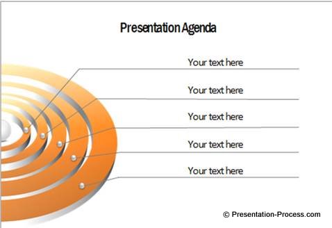
Source: Agenda Slides for PowerPoint Charts & Diagrams CEO Pack
4. Show them where they are – using simple sign posts
A good site design ensures that a visitor is always aware of where he is in the site. This gives a sense of assurance and control to the visitor.
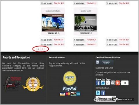
The principle applies to PowerPoint presentations too. Let you audience know the topic they are in at any point of time.
In the following example, the webs-style bars shows that the slide belongs to the fourth point in the agenda. The numbering of slides tells the audience where they stand.
5.Let your title summarize the content of the page
Take a look at the web page in this example. When you read the title, you know that the page is about showing you how to create a glossy ball. There is no clever play of words like you see in the titles of magazine articles.
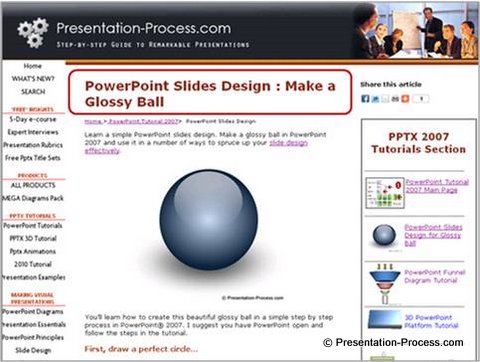
This applies to your PowerPoint slides too. Your title should make a clear assertion and the body of the slide should show the evidence that supports the assertion. The following example shows you how.
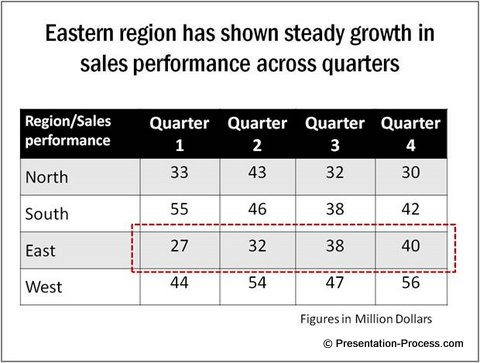
The title quickly guides the audience attention to the relevant portion of the table. Your point gets made without any confusion.
Read: Using clear assertions and evidence when designing your presentation slides
Conclusion:
The 5 points we discussed are meant to start you off on an exploration of best practices as a PowerPoint Designer.
Take a little time to visit a number of good websites with an intention of learning the principles of effective slide design. You will be amazed at the extent of learning you will get. There are a number of articles in this site that help you fine tune your slide design skills.
One way to create professional presentations quickly and effectively is to use good quality diagram templates. We recommend that you take a look at the PowerPoint Charts & Diagrams CEO Pack. The article showcased some of the diagrams from the pack.
The Pack has 750+ high quality PowerPoint diagrams that you can copy paste to your slides to convey your message effectively. The pack is a must have collection if you are a serious PowerPoint designer.

