Home > Presentation Ideas > Presentation Graphics > PowerPoint Infographics
Here are 6 PowerPoint Infographics covering a range of ideas about Slide Design. This includes color selection, creative use of Smartart, effective use of data and more.
The 6 Infographics include:
- Guide to using Color on slides
- Creative SmartArt Ideas
- How often do presenters use SmartArt ?
- Framework to making slides visual
- Effective Slide Design Infographic
- Steps to Present Data better
1. Using color in your presentations
The colors you choose to use in your slides has an impact on your audience. Here is a quick overview in the form of an info graphic.
Click on the Image below to view details
2. Infographic about using SmartArt creatively
SmartArt is part of your PowerPoint. Here are 5 quick ideas to customizing your Smart Art diagrams instantly.
Find more articles on creative use of Smart Art to create custom diagrams and charts instantly here >>
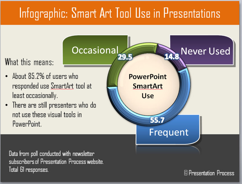
3. How Often do Presenters use Smart Art
We had done a survey with our newsletter readers on how often they use the inbuilt SmartArt tool. The answers were revealing. Here is an PowerPoint infographic showing the results of the survey.
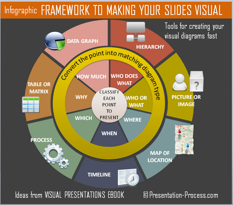
4. Framework to making slides visual
One of the key areas where presenters have an issue using charts and diagrams, is knowing how to make the content visual. This quick chart shows how to classify the content of the slides and make it visual as a result. The material is taken from Visual Presentations eBook.
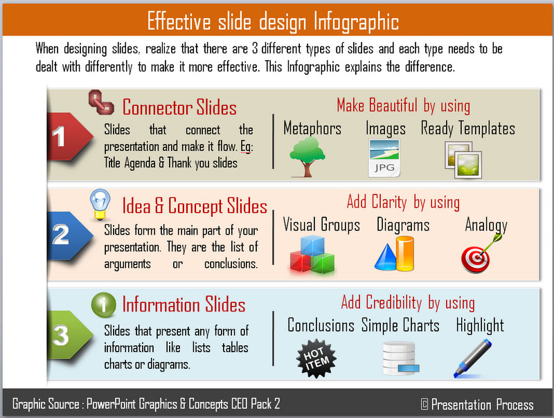
5. Effective Slide Design Infographic
Slide design is not just about making slides beautiful. Slides can be divided into 3 types
The type of changes you need to make to your slides to make them effective depends on this classification. This graphic below shows an overview of how to make each slide type effective.
6. 3 Steps to Present Data Better
We have a whole section on how to create and present your data and graphs better. This info graphic provides a birds eye view of the suggestions.

If you’d like more details about presenting data, you can see the articles on this section.
In conclusion
These 6 infographics provide a quick summary of many of the detailed articles we have written in this website. It provides a reference guide when you are creating your presentations.
If you found any of the info graphics useful, please do share them and leave us a comment.
Related: 6 Infographics about Creating Presentations


