
Home > Presentation of Data Page > powerpoint infographics
Find creative ways to show the concept of ‘percentage completion’ using info graphics PowerPoint. Make your slides attractive and your message memorable.
Why use PowerPoint infographics to show percentage completion?
Whether it is a project report or business update – a slide showing percentage completion is a necessary part of most business presentations.
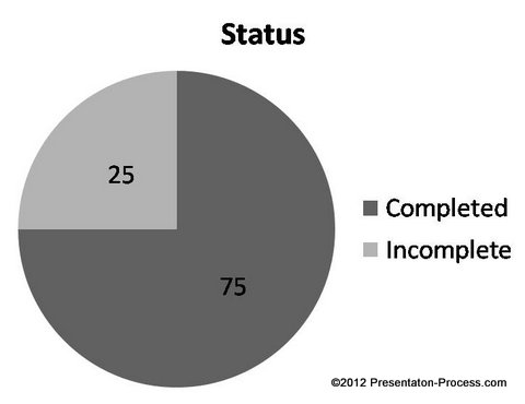
The usual way of showing percentage completion is to use either a boring bar chart or pie chart.
 . In this article, we will see some interesting alternatives to show percentage completion using PowerPoint Info graphics. All alternatives use interesting visual metaphors to convey the message.
Note: All the data slide templates you see in this article are part of ‘Visual PowerPoint Graphs Pack’. The templates are fully data driven and are surprisingly easy to use. You just need to replace sample data in the embedded worksheet with your own data. The chart updates itself automatically. All the charts you see here require you to replace just one number that indicates percentage completion.
1.Using ‘level of fill’ as an indicator:
A glass jar filled with liquid is a simple metaphor to represent percentage completion. The following data driven info graphic uses the metaphor in an elegant way:
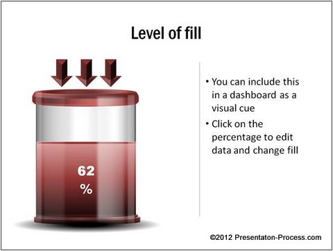 You can use the info graphic to explain strategic concepts too. The sheen and gradient fill used in the graphic makes it visually attractive.
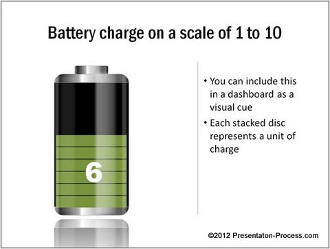
2. Using the level of charge as a metaphor:
You can use the level of charge in a battery as a metaphor to show percentage completion. Take a look at the following PowerPoint template:

Source: Percentage Completion Infographic from Graphs Pack
You can show the extent of completion on a scale of 10. Each unit in the following template represents 10%:
 Related: Create your own battery – tutorial in PowerPoint
3.Using syringe as a visual metaphor:
If you are from pharmaceutical industry, you can use syringe as a metaphor to show the level of completion of a project. Take a look at the following data driven PowerPoint infographics template for example:
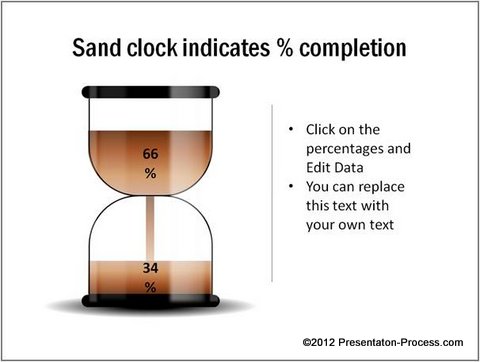
 4.Using the metaphor of Sand clock:
A sand clock shows time that has ‘run out’. The following chart template uses the metaphor to indicate percentage completion of a project:
5.The level of load on a truck as a visual cue:
If you are in logistics business, you can indicate percentage completion by the level of load on a truck.

Source: Percentage Completion Infographic from Graphs Pack
It is almost impossible to believe that the above PowerPoint infographics are completely data driven. To edit the chart you just need to change one number in the embedded worksheet.
To Conclude…
So, with a bit of imagination it is possible to create visually stunning data slides that make your message memorable. However, creating data driven info graphics from the scratch takes a lot of effort and time. Most business presenters don’t have the time it takes to make such memorable slides, and hence settle for the ‘usual’ mediocre slides.
That is why we came up with our Visual PowerPoint Graphs pack. The pack has more than 320 business relevant data driven PowerPoint graphs and info graphic templates. The templates are super easy to use. You can take a look at this demo page to see the ease of use.
Why waste time constructing your charts from the scratch, when you have such a high quality solution available off the shelf?
Related: Unusual Chart Templates in PowerPoint
Return to Top of PowerPoint Infographics for Percentage Completion Page