
Home > Presentation Tips on Flow > PowerPoint Rules to Break
How relevant are the 3 BIG PowerPoint Rules professed by Presentation Gurus to your business presentations? Discover the truth regarding some of the presentation fads.
Presentation Styles are changing…

In the last few years we have seen a significant evolution in the field of presentations. We don’t see those intimidating blue slides with bulleted paragraphs in yellow fonts in conference rooms any more (OK. At least, the frequency has reduced).
The slides today are far more visual than they used to be.
While the trend is encouraging, we also see cases where certain ‘Rules’ are being generalized out of context.
Let us take a look at the 3 BIG rules for PowerPoint and their relevance to business presentations.
Rule 1: Design slides like Bill boards
Many presentations gurus advocate the use of ‘full page photos with a short caption’ for slide design. They want your slides to look like Bill boards.

The rule works remarkably well for keynote presentations or TED talks. But, it fails miserably when you try to apply it in a board room business presentation.
Here is why:
Keynote presentations are usually about the ‘views’ of the presenters. They are meant to be ‘idea oriented’ instead of being ‘detail oriented’. So, they can get away with a full page stock photo on a dark background or by putting one clever word on a slide in font size 200.
Business presentations are detail oriented. You need to back your views with proof. You need charts and diagrams to build your case. ‘Bill board like slides’ will make your business presentations look vague and superfluous.
Our suggestion about PowerPoint Slide Design:
Don’t get too hung up on ‘Bill board look’ for your business slides. Show the best proof for your claim. It may be a photo, a graph or a diagram. Focus on message clarity. That’s what matters for your audience.
5 reasons why billboard-type PowerPoint Slide Design is wrong
Rule 2: 10/20/30 rule

This rule was advocated by Guy Kawasaki some years back for pitching business to venture capitalists. Many presenters have started generalizing the rule for every occasion, without understanding the spirit behind the idea.
It is impractical to begin designing a tactical business presentation with an outer limit of 10 slides.
The number of slides depends on the subject on hand. The time you take depends on the level of interaction you want to elicit. The font size you use depends on the conference room size (Just ensure that everyone in the room reads your slides without straining their eyes).
Our suggestion number of slides:
Create a strong outline for your presentation. Line up strong evidence for every assertion you make. Make one assertion per slide and have a compelling evidence to support the assertion. You can count your slides later.
Effective PowerPoint Design with Assertion Evidence framework
Rule 3: Get Rid Of bullet points
Every Presentation Guru with a blog advocates this presentation rule. So presenters select their bulleted list and use ‘convert to SmartArt’ option and come up with a pseudo diagram like this:
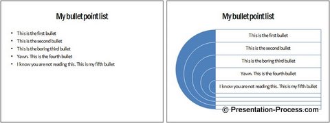
Is there any real value added by converting a bulleted list into a cool SmartArt diagram like the one you saw just now? I doubt it.
The actual idea of the PowerPoint rule was to encourage presenters to think visual.
You add immense value to your audience when you visualize your idea. Your audience understands your message faster and remembers your point longer when you present your concepts as simple diagrams.
Our suggestion about Bullet Points:
Instead of seeing the rule as ‘Get Rid Of bullet points’ start seeing it as ‘Make your Message visual’. Your audience will love you for it.
By the way, bullets are very useful to present a list. Use them judiciously instead of abandoning them blindly.
Examples of making Presentations Visual
Visual Presentations eBook: The book gives you a simple 3 step process to convert your text based slides into simple visual diagrams.
Conclusion about PowerPoint Rules:
Every month 18,100 searches are made in Google on ‘PowerPoint rules’ globally (Source: Google Keyword tool). The truth is – ‘there are no rules that are applicable to all situations’. Use your common sense before following the advice of Presentation gurus.
Don’t forget to sign up for the Presentation Process Newsletter. It is filled with tips and advice on the latest Presentation related updates and resources for Business Presenters.
Return to Top Presentation Tips Main Page
Return to Top of PowerPoint Rules to Break Page