Home > Presentation of Data > Present Data better
The data component of a business presentation plays a critical part. It is important to present data clearly.
Here are 5 steps by to make complex or confusing data slides – simple and powerful.
Let’s see how you can rework the ‘usual’ PowerPoint data slides and bring clarity to our message. We will take a poor slide and try to present it in a better way. Here is a slide which shows a table of data related to student scores.
As you can see, the slide looks confusing and the main message is not clear.
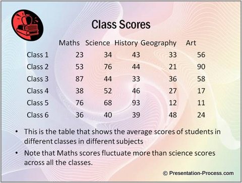
The main point that the presenter wants to bring out from the slide is Maths scores fluctuate more than science scores.
Let us try to improve the data presentation in stages to make this message clear.
Step 1: Clear Assertion and Evidence
A good visual slide is designed based on assertion-evidence framework.
This ‘assertion-evidence framework’ is something you use quite commonly in your business communication. Here are some examples –
- ABC provides hygienic food. The proof is their certification
- Our marketing campaign was effective because our ROI was positive
- Our back end processing is accurate because our error rates are less than 2%
The words in bold black font are assertions. The words in bold aqua color are evidences. Remember, every time you use words like – ‘because’, ‘the reason is’ etc. you use the assertion evidence framework to express your ideas.
In a PowerPoint slide, there is a clear place for assertion, evidence and explanation of the slide. Here is the pictorial representation:
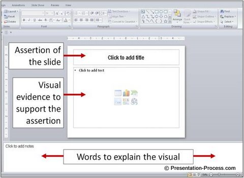
To makeover the slide like this, we will do the following:
- Make a clear assertion: Title the slide Maths scores fluctuate more than science scores – which is the main point of the slide
- Remove clutter: Since the gaudy background and unprofessional clipart are taking away the attention and making it difficult for audience to read the slide, we will remove them
- Make the evidence easier to understand: We will make the large table of numbers easier to understand by using a chart.
The result of these changes to present data better:
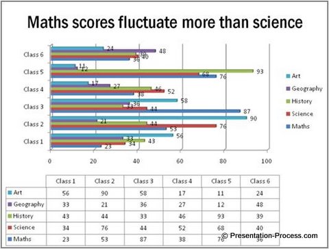
This graph slide still looks a little complex. But the clear assertion on the slide title helps the audience ‘get’ the message. The inference or evidence to support the claim however is not obvious.
Let’s make the following changes in the chart to improve clarity:
- The table and the chart convey the same information, so we can remove the table
- The labels are cluttering the chart, so we’ll remove the labels
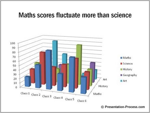
The result is this slide:
Step 2: Visualization
Visualization is the art of capturing relationship between objects in visual form. The relationship between objects could be on the basis of time, space, action and quantity.
While the slide has improved in cleanliness, the 3D chart does not show the relationship clearly. It creates an additional dimension for the audience to think about, which makes it difficult to understand.
So, we make the following changes:
- We will use a simple line graph instead of the fancy 3D column chart.
- We will clearly label the y- axis
The result of creating a more visual slide is this:
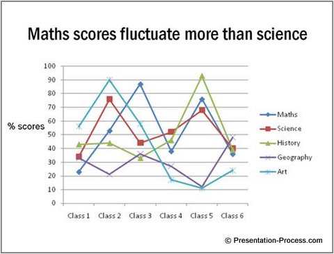
The line graph has definitely made the slide easier to understand. So, the visualization is clear. Now, it is time to work on the obviousness of the evidence when you present data.
If you are looking for a simple and easy solution to make your presentations visual and insightful, we recommend taking a look at the visual graphs pack…
Step 3: Obviousness
You can make the evidence obvious by using contrast. Since we are only concerned with the scores of Maths and Science, we will dim the lines showing the remaining subjects.
The result is:
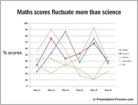
We are almost there. With some minor tweaks we can present data in a clear and memorable way.
Step 4: Build with animation
You can build the elements when you present data by breaking the information into logical parts. Then, give explanation at each stage to help your audience understand your information in small incremental steps.
- We can add animation to Build the information in steps as follows:
- First show the slide title and the 2 axes. Explain the axes.
- Then present the science scores. Let the audience absorb the information for a few seconds
- Then present the Maths scores and talk about the wide fluctuations
- Highlight the fluctuation for better clarity
Use of animations help in making PowerPoint Slides more effective.
Step 5: Cleanliness
Finally, remove the clutter from your slides. Keep your slides clean and simple.
Here are the changes we make to improve cleanliness of the slides:
- Since the audience needs to keep referring to the legends to make sense of the lines, let’s label the relevant lines clearly
- Since the information about other subjects are irrelevant to the point of discussion, let’s remove them all together
The result of removing clutter when you present data is:
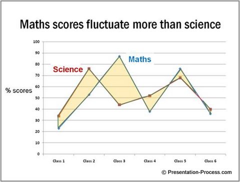
Thus, you saw how in 5 steps, you can make improvement in the clarity of your message.
Compare the before and after slide to understand the difference these 5 steps have made:
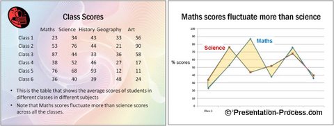
Once you ensure that these 5 points are taken care of, your PowerPoint slide will look simple and effective.
Let me quickly summarize the parameters we use to evaluate the slides:
- Assertion and evidence: Have a clear slide title and provide supporting evidence
- Visualization: Present your ideas and concepts as visuals to enhance the clarity
- Build : Use animation to present data
- Obviousness: Highlight the message you want the audience to infer
- Cleanliness: Reduce clutter removing all irrelevant points
Related: 5 Examples of Visual Presentations using Analogy
Return to Top of 5 Steps to Present Data Better Page

