Home > All PowerPoint Tutorials > Presentation Infographics
The PowerPoint Infographics Section has a range of tutorials related to creating creative info graphics and tips for data driven graphs.
Articles in this section
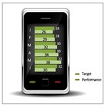
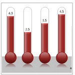
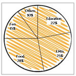
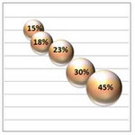
![]() This section starts with creative graphics you can create your represent data. Instead of using the usual inbuilt graphs, you can use these options and add more insights to your data.
This section starts with creative graphics you can create your represent data. Instead of using the usual inbuilt graphs, you can use these options and add more insights to your data.
|
|
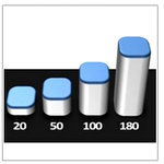
Using Graphics To Represent Data
These tutorials cover ways to represent data that are not data-driven. You can use them to highlight a critical point or make the information easy to understand.
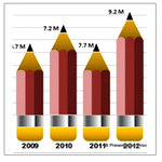
Creative Infographic with Pencil Icon
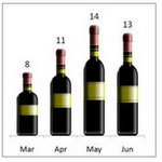
| Create Pictographs in PowerPoint
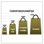
| Info Graph with Shopping Bag icon
|
|
|
|
Data-Driven Graphs : Tips & Tricks
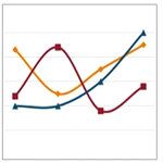
In this section you’ll find tips and tricks for presenting data-driven graphs creatively. A number of hidden features of PowerPoint are revealed in these articles:
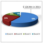
Pie Chart: 3 Big Issues and Solutions
|
|
|
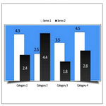
| Formatting Tips for Charts in PPT 2010
|
|
Trick for Hand drawn Charts in PowerPoint
|
|
Using Info graphics:
PowerPoint Info Graphics need to be used only occasionally. It is better to avoid info graphics in the following cases:
- When the data needs to be understood in detail
- When there are too many data points
- When it will not add value
In these cases, it is best to use regular inbuilt graphs in PowerPoint. All you need is to use small tips and tricks to highlight and present the data with clarity.
When the graphic will not interfere with clarity of your message, you can use the creative formats suggested above. When using such graphics for data, ensure that:
- The graphic represents the data accurately
- It is easy to understand
- The graphic has some relevance to the topic of the presentation
If you liked this section on graphs, do visit the detailed data visualization section for more ideas and tips.
You can find more tutorials in the main section…
Return to Main PowerPoint Tutorials Page


