
Home > Presentation of Data Page> Project Management Charts
Find three useful PowerPoint charts you can use for project management that help you track progress of a project. Make your charts remarkable and your message memorable.
Beyond the usual Project management charts:
Success of a project depends on the way the project is tracked on a constant basis. That is why charts and dashboards play a critical role in project management. However, most business presenters can’t think beyond Gantt and PERT charts when it comes to project management charts. In this article, we will share with you three other useful chart templates that help you track the progress of your projects.
The chart templates are taken from our Visual PowerPoint Graphs pack. The pack has 320 business relevant data driven graph templates that are super easy to use. We will share more details about the pack later in the article.
1. Burn down chart:
To measure the progress of a project, the two key metrics are:
- The extent of work completed compared to target and
- The rate at which the work is completed compared to the target rate
In the following chart template you can track both the metrics in an elegant way:

Source: Charts for Project Management from Graphs Pack
The chart is quite handy to be included in a project management dashboard.
Sometimes, business presenters hesitate to include such insightful charts in their dashboard because of the time it takes to update these charts each time. A smart way to overcome the issue is to save the chart as a template in Excel. You can go a step further by saving the template in PowerPoint where the chart is created using the capabilities of Excel embedded in PowerPoint.
For example, in the above chart template, when you right click on the chart and go to ‘Edit data’ a worksheet opens up as follows:
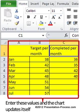 When you enter relevant values in the yellow cells, the chart updates automatically.
You save the pain of copying the chart from a separate Excel sheet, formatting it, positioning it on a PowerPoint slide, adjusting the size and making space for text that accompanies the chart. A good PowerPoint chart template can save hours of effort and frustration for busy business presenters.
Related: Create a Calendar in PowerPoint
2.Cumulative achievement vs Cumulative target
This useful variation of burn down chart shows cumulative performance compared to cumulative target:

You can adjust your allocation of man power and materials based on the simple visual cue you get from the chart.
Related: Visual Metaphors for PowerPoint Charts
3. Revised target chart
Take a look at the following chart template:

Source: Charts for Project Management from Graphs Pack
The chart automatically recalculates monthly targets based on performance till date and the number of months left to complete a predefined production target. The black line indicates the number of units still to be completed.
Here are the values you update in the accompanying worksheet:
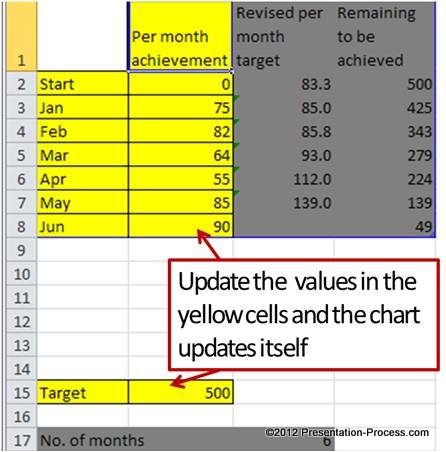 Just enter the production target, number of months and per month achievement. The preformatted chart template takes care of the rest.
Inference:
Good charts and dashboards enhance the productivity levels of a project team. We urge you to take a look at the collection of useful chart templates from our Visual PowerPoint Graphs pack. The templates help you convert raw data into insightful charts in no time.
You can visit our demo page to see how easy it is to use the chart templates. Why waste time constructing your charts from the scratch when you have such a high quality solution available off the shelf?
 Related: Common Mistakes in Presenting Data
Related: Creative Ideas for Data Presentation