Home > Presentation of Data Page> Survey Reports
Discover creative ideas to spruce up your reports for surveys. Find interesting graph templates that help you visualize your survey data in a memorable way.
A quick word about Survey Reports:
Survey related reports are usually very boring. It is not easy to go through those mind numbing data tables that list ‘Yes’ or ‘No’ responses to survey questions. In this article, we will see some useful graphs that spice up your presentations related to survey.
1. Yes/No Chart:
Using a graph instead of a table makes it easy to visualize data. For example, take a look at the following table:
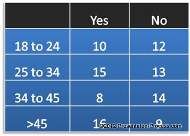 While it is easy to read absolute numbers from the table, it is difficult to get a comparative perspective of the contrasting responses.
If the same information is visualized as a bar chart, you can ‘get’ the message easily:
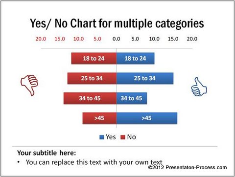 Of course, you can always add simple icons like the ones you see above to enhance the visual interest of your chart.
2.Yes, No, May be responses:
Your charts need not be plain and boring. You can modify certain elements of your charts to convey more meaning.
For example, we replaced one of the columns in a clustered column chart with a two sided arrow to indicate the ‘in between’ state of mind of survey responders:
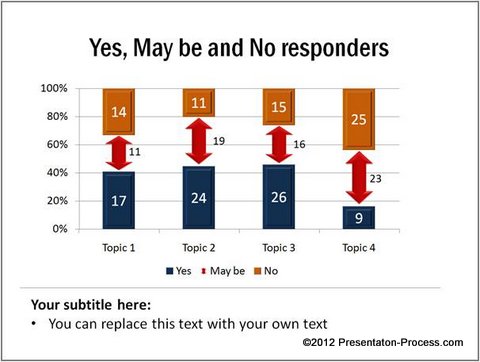
Source: Yes and No Response Charts from Visual Graphs Pack
3.Using colored arrows:
Here is a chart variation that shows Yes, No, Neutral responses. We used arrows instead of boring columns to indicate the type of responses. We used Green color to indicate ‘Yes’ and Red to indicate ‘No’.
It helps to reinforce your message with such subtle cues.
 You can use more sophisticated alternatives to make your survey reports look more interesting and professional. For example take a look at the following…
4.Butterfly chart/ Tornado chart:
A butterfly chart/ Tornado chart indicates percentage of contrasting responses. Since the text is in the middle, it is easy to read the context of the bars.
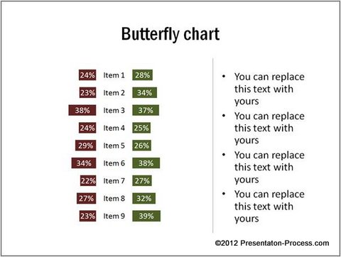 Isn’t that an interesting way to present your survey reports?
Source; Butterfly Charts and More from Visual Graphs Pack
5.Using modified Bubble charts:
Who says you need to settle for columns and bars to visualize your survey responses? Here is a modified version of bubble chart to help you show two types of responses:
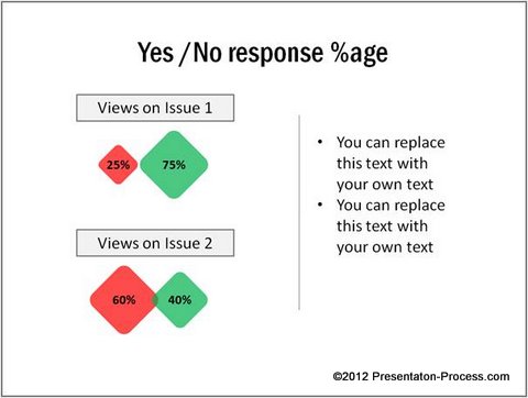 The size of shapes reinforces the percentages.
Inference:
You can make any document or presentation look interesting by using a bit of imagination. In this article, you saw examples that showcase the power of creativity in spicing up the most mundane of survey reports.
While beautiful charts make your message memorable, they take a lot of time and effort to create from the scratch. For most business presenters like you, time is at a premium. That is why we came up with our ‘Visual PowerPoint Graphs Pack’.
The pack has more than 320 business relevant graphs and info graphic templates to help you create stunning data presentations in no time. In fact, all the chart templates you saw in this article are taken from the pack. Take a look at some more samples from the pack:


Speedometer, Dashboards and More
 It is super easy to edit the data driven templates from the pack. You just need to replace the sample data in the templates with your own data. The pre-formatted charts update automatically. Here is a demo that shows you how simple it is to edit the charts.
Why waste your valuable time constructing data charts from ground up, when you have such a high quality solution available off the shelf?
Related: Make Data Presentation Insightful with these 5 Ideas
