Part of : 320+ Visual PowerPoint Graphs Pack
Widest Variety of Data-Driven Graphs & Infographics for PowerPoint
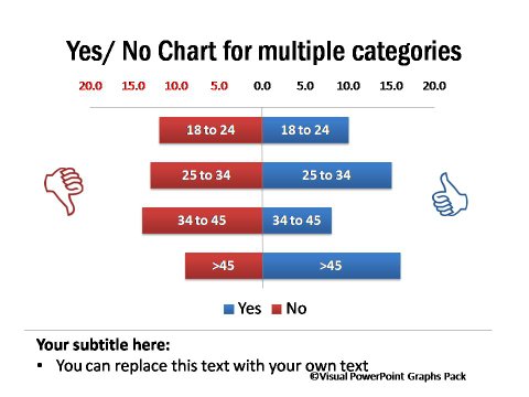
Yes and No Charts for Multiple Categories

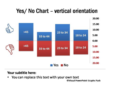
Description: The Yes/No chart shows responses among different age categories for an issue. It is useful to present results of survey. It is also called two-fold charts or butterfly charts.
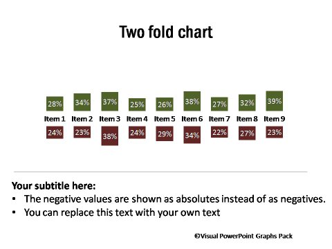
This set also contains Butterfly charts that shows percentage values for two categories on the same parameter. The chart is also called as tornado chart.The chart is useful to explain percentage of contrasting views in survey responses for different questions.
Vertical Yes and No Chart

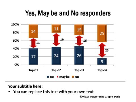
Yes, Maybe and No Survey Response Charts

Butterfly Charts

Two Fold Chart

Data-Driven 3D Population Chart

