
Home > Presentation Design > Branded Presentations

 |
Hey my name is Andrea ‘Dre’ Beltrami and I’m a visual marketing strategist & blogger. My Chic Geek Academy blog and I help solopreneurs create wildly successful businesses through techniques such as branding, visual marketing and relationship building! A trifecta that’s taken tons of stumbles and years to learn, perfect and hone. |
Simply put, the formula I use delivers results and builds lasting brands and businesses. Stop by, say hi and let me know how I can help you and your visual mastery!
Branding is the single most powerful tool you have in your arsenal.
It allows you to silently differentiate yourself from the masses and elevate the recognition of your products, programs and services…
…all without uttering a word.
You have to understand, 90% of information transmitted to the brain is visual.
Meaning, people have a greater propensity to remember what they saw opposed to what they heard.
One of the most overlooked and poorly executed branding opportunities is in your presentations (whether that be PowerPoint, Keynote, Prezi or any other software).
Presentations are by nature visual (at least they should be!), so it’s your job to provide the triggers a viewer needs to create or continue shaping the visual patterns that are unique to your brand.
It’s the familiarity and recognition of those patterns that will differentiate you from the abundance of bright lights and noise out there.
Here Are 3 Keys To Branding Your Presentations Like A Pro:
Color Palette |
Creating a color palette will give your presentations the consistent visual pattern I mentioned earlier.
So what makes a presentation friendly color palette? A couple things.
Obviously, you want to start with the colors in your logo. But, since logos typically consist of 1-2 colors you’re going to need to expand your color scheme.
See, a presentation that uses one or even two colors will fall flat and be unable to create the visual stimulation a viewer needs to create and hone a unique visual pattern.
Instead, create a presentation friendly color palette with these guidelines:
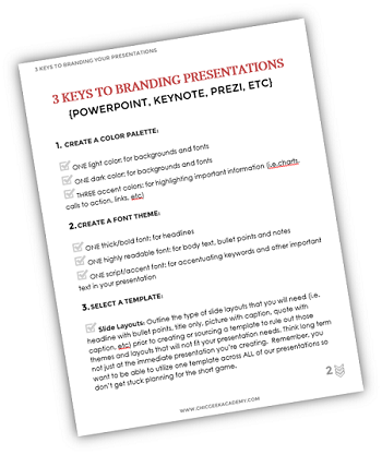
ONE Light Color: for backgrounds and fonts
ONE Dark Color: for backgrounds and fonts
THREE Accent Colors: for highlighting important information (i.e. charts, calls to action, links, etc.)

Here’s a couple of examples of presentation friendly color palettes…

Quick Tip:
If you would like to use the exact colors in the above palette in your Presentation, you can use the Eye Dropper Tool option under Shape Fill Menu in PowerPoint 2013. You can find a tutorial video where the tool (and alternatives) has been used here.
Font Theme |
Creating a font theme for your presentations will help folks create a connection with your brand by way of shear repetition.
For those of you that have never heard the phrase ‘font theme’ it just a preset of font selections that outlines what fonts will be used for specific elements.
For instance, here’s a logo and tagline that uses three fonts: Century Gothic, Inline Intro, and Great Vibes
 Sample Logo
And here’s a couple presentations slides using those same fonts as a theme…

Can you see how using a font theme consistently throughout your presentations is another way to drive home a visual pattern for your viewers?
If you don’t have a logo or your logo has decorative fonts that are not readable here’s a guide for creating your presentation font themes.
ONE Thick/Bold Font: for headlines
ONE Highly Readable Font: for body text, bullet points and notes
ONE Script/Accent Font: for accentuating keywords and other important text in your presentation

Presentation Template |
Using a template to create the slides for your presentation will help you streamline the branding in your presentations.
So, you’ve got two options for presentation templates. You can create your own OR you can upload one of the 100’s of free or paid templates on the web.
Myth Busting: Many folks naively believe that using a template will make a presentation look canned and far from unique, BUT those people simply don’t know how to use templates correctly.
To help you use a template effectively in your branded presentations here are 4 critical things to keep in mind when finding or creating a template:
- Outline the type of slide layouts that you will need (i.e. headline with bullet points, title only, picture with caption, quote with caption, etc.) prior to creating or sourcing a template to rule out those themes and layouts that will not fit your presentation needs. Think long term not just at the immediate presentation you’re creating. Remember, you want to be able to utilize one template across ALL of our presentations to create those visual patterns so don’t get stuck planning for the short game.
- Keep in mind that all the major presentation tools (Presentation & Keynote) let you customize the colors of a template. Meaning, don’t get hung up on colors when picking your template as you’ve already created the branded color palette you will be using once your new template is ready to rock and roll.
- Free themes are NOT lower quality or worse by default simply because they are free. Yes, while ‘You get what you pay for!’ rings true very often it doesn’t when it comes to presentation templates. I can tell you from personal experience that free themes can be pure awesome sauce. What’s more important is to find a site that has quality templates. My go to free source for templates is….wait for it….Microsoft. Yep, you heard me!
- Prior to creating or choosing a template decide whether you will use a standard size or a widescreen size for your presentations. Two important things that will determine that choice are: what technology you will be making your presentations on and how you intend to re-purpose your presentations (Slideshare, video, etc) later on. It’s important not to create more work for yourself, so while templates can usually be resized inside your presentation software it’s not always the easiest or most straightforward transition. Plan and THEN execute! Great advice for branding in general but especially when it comes to branding a presentation.
So, there you have it! The 3 key factors to successfully branding your presentations.
BUT, guess what? I saved the best for last!
What’s the best part about utilizing these 3 key factors in branding your presentations?
When you decide to re-brand (and you WILL) you can swap out each of these three elements QUICKLY and EASILY with just a couple clicks.
Meaning, when you use a color palette for your presentation and later change that color scheme it’s as easy as updating the color theme and BAM the colors are updated presentation wide. If you want to change your headline font, easy peasy. All you have to do is update the headline font in your font theme and voila your slides all update automatically. If you chose to use another template, no problem. You can upload the new template, select it and your entire presentation will be updated to reflect the new template.
Use these 3 elements (color palette, font theme & template) to create the familiarity and repetition viewers need to form and retain a unique visual pattern they can construct to immediately recognize your brand, products, programs and services again and again. Remember: One of the most important factors of a brands success is its level of brand recognition.
Clear and consistent branding at its finest, baby!
 |
You can download a complimentary presentation branding checklist to take with you as you pack your presentations with branding power. My gift to you for letting me guide you on your branding and presentation mastery. Thanks a ton! |
Thank you, Dre, for taking time to share your insights based on your experience with our readers!
Arte R
Presentation Process
Related: 5 Best Practices from Web Design for a PowerPoint Designer