Home > Presentation of Data Page> Creative Data Presentation
Do you know that we get a significant portion of our daily information as Charts & Diagrams? Read the article to know how and use the knowledge to make your business presentations more visual.
You are natural at drawing charts and diagrams
We conduct Visual Presentation workshops for business managers. When ask our participants the reason why they create boring text based slides, the first excuse we get is – that they are not good at visualizing charts or diagrams. When we show them how natural they already are at drawing charts and understanding diagrams in their everyday life, they are amazed.
This article lets you see the world around you in a fresh new way. It makes you realize the extent to which you use visuals to receive and convey information in day to day life.
The Line Charts you draw in the air
Can you recall the last conversation you had with your friend? You not only talked about the roller coaster ride you enjoyed over the weekend, but also gestured the way the coach moved along the rail.
When you talked about the rising prices of real estate, you also drew an imaginary line chart in the air like this:

When you are excited, it is almost impossible to talk without drawing a related visual to reinforce the message. You may draw the visual on a paper napkin with a pencil, or with a stick on sand, or with your hand in the air. The fact is – you already are good at drawing diagrams.
Read: Creative Data Presentation Ideas
The Pie Chart on your wrist
Take a look at the watch on your wrist. When you look at the dial, you don’t just read the time, you also read the context.
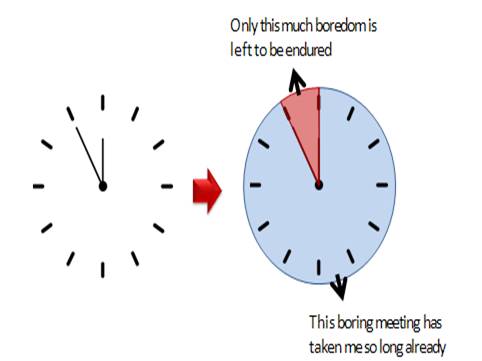
The reason is – you see the watch as a pie chart (with the two hands representing the wedges of the pie). When you know how to read the time in your watch, you also know how to read a pie chart.
Read: PowerPoint Design Basics
The Doughnut Chart on your car dashboard
When you drive a car, when the needle on fuel-dial hovers over ‘reserve’ levels, do you automatically drive to the nearest gas station?
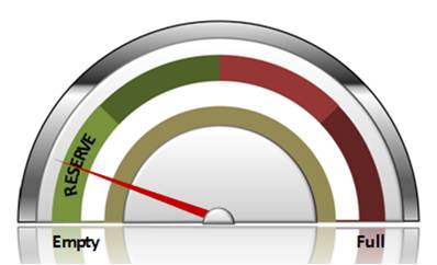
Then, you already know how to read a doughnut chart...
Here is an example of Data-Driven Speedometer Chart from Visual Graphs Pack
Data-Driven Speedometer with Completion Percentage

The bar chart you put in your mouth
A thermometer is nothing but a bar chart with benchmark index. When you know how to read a thermometer, you know how to read a bar chart too.

Example of Data-Driven Thermometer Chart

The Column Charts in your Pocket
Take a look at the cell phone in your pocket.

Do you see two column charts on the screen?
You may not have called them that. But, if you know how to read the levels of signal strength and battery charge by looking at your cell phone screen, you know how to read a column chart.
Read: 5 Steps to Present Data Better
Diagrams that tell you where you are
Do you look for a train route map when you are stranded in an unknown underground railway station?

Do you look for a floor map when you are lost in a mall?

Then, you are already familiar with visual diagrams and know how to make sense of them.
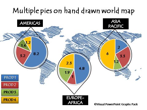
Hand Drawn World Map with Pie Charts from Graphs Pack
Icons that keep you safe on the road
Do you know what to do when you see signs like this on the road?

These signs too are kinds of charts and diagrams. Then you are already familiar with icons and what they mean.
Interested in more creative and inspirational business ideas you can find around you?
A lot of information around you is presented as visual diagrams
Visual charts and diagrams are everywhere around you. In fact, you receive a substantial portion of your daily information as visuals. Visuals are powerful because:
- They are easy to understand
- They are quick to process
- They are unambiguous
- They are accurate and
- They go beyond language barriers
It is because of this very reason, that visuals are so effective in communicating your business concepts too.
Related: Data-driven PowerPoint Sales Funnel
Make visual presentations
If there is one skill you must learn to substantially enhance the effectiveness of your business presentations, it is to convey your ideas as visual charts and diagrams. This site gives you a number of useful resources to enhance this critical skill. We urge you to browse around.
If you are really serious about using Visual Graphs in your preresentations, you must look at the Visual Graphs Pack for PowerPoint. It contains 320+ data-driven graphs and infographics.
All the data-driven graph examples in this article are from the pack.
You can browse through the pack and get this resource for yourself here >>
Return to Top of Charts and Diagrams Are Everywhere Page
