Home > PowerPoint Slides > Visual Chunking
Learn one of the key principles of Effective PowerPoint Slide Design. Make your message clear and obvious to your audience by using the power of organizing information in chunks.
Let us start with an every day example. Have you observed that the 16 digits of your credit card are written in chunks of 4 instead of as a single,long 16 digit number?

The phone numbers you see in Classified advertisements are chunked too:

The reason is – our mind absorbs and processes information by dividing large complex data into small, related groups called chunks. These chunks are easier for the mind to organize and retrieve information for future use.
By organizing the information on your slides into clear and distinct visual chunks, you can enhance the clarity of your message in a significant way.
What is Visual Chunking?
It is the act of organizing and presenting information as easily recognizable groups, so that the audience can understand and process your information quickly and clearly.
To create effective visual chunks…
1. Group the related elements on the slide and
2. Contrast the unrelated elements
When the grouping is clear and the contrast is obvious, audience finds it easy to understand and process the information on your slides. This grouping is an important part of effective presentation design.
Let us understand the principle using a simple example:
Take a moment to go through the following slide:
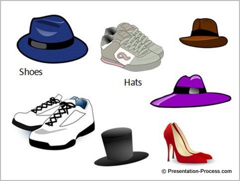
Did you notice that the moment you saw the slide, your mind automatically starts establishing a pattern among the various elements on the slide?
It happens because, our mind is wired to search for patterns to make sense of the information we find around us. If the pattern is not obvious, we try to create our own pattern – without bothering about what was originally intended by the presenter. This is the point where many presentations fail as audience create patterns not intended by the presenter.
The situation gets worse when the slide has too many items. Our mind refuses to process the data dump and switches off altogether.
What is the way out?
Let us see how to remedy the situation. The first step is to bring the related elements on the slide closer together:
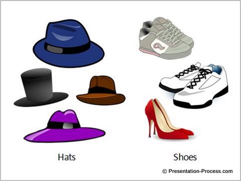
It is now a little easier to establish a pattern than in the earlier slide. We can definitely improve the slide further.
The second step is to contrast the groups clearly, so there is no visual ambiguity. Here is the result:

The difference is amplified by using two different colored boxes in the background for the two groups. The white space between the two boxes adds to the contrast.
Now, we have two clearly distinguishable visual chunks. Your audience will have no trouble understanding and remembering the information.
Let us see the application of the principle while presenting lists on your slides.
Take a look at the following example of a presentation slide:
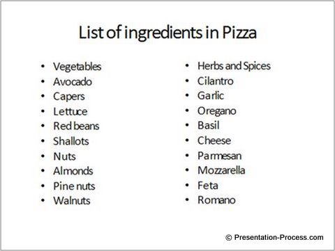
There is too much information for the mind to make sense of. It is almost impossible for someone to chunk the list into logical components to process and remember.
The following slide is an improvement over the previous presentation:
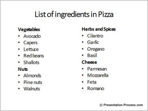
The list is categorized into 4 groups. The category titles are differentiated by different font styles. The titles are written with bold font, and the bullets are removed.Though the slide is better, it can be improved further by accentuating the contrasts as follows:
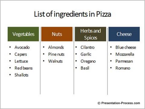
The homogeneity of the related elements is shown by separating the related items with light grey lines. The contrast between the sets is shown using different colors for the titles.
Using this important principle, you can quickly improve the clarity of your slides quite significantly.
Getting to effective slide design
One of the quickest ways to create effective slide design is to use professional templates to organize your information. We strongly recommend you to consider the following pack to help you create professional presentations in minutes.
Why leave your critical presentations to chance when you can make a lasting impression on your audience with our off the shelf solution?
This article is part of series on Effective Slide Design. You can find the other 2 parts here:
