Home > PowerPoint 2007 Tutorials > Create 3D Column Chart
Learn to create stunning 3D chart manually in PowerPoint. Watch and learn from our video tutorial.
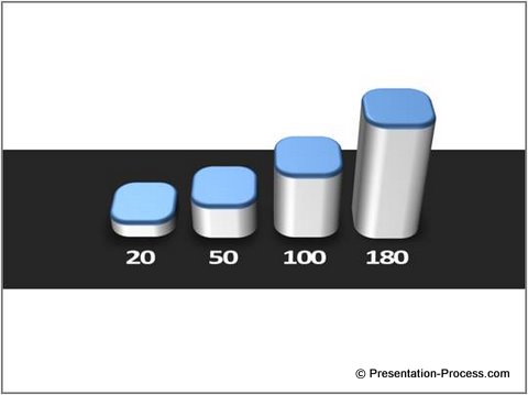
The 3D column chart you will learn to create is:

It is quite easy to create charts that look as elegant as this in a matter of minutes. Once it is done, you can label it as per your requirement. Such simple and powerful charts create a long lasting impression on your audience.
Why create PowerPoint charts manually?
Your audience is tired of watching the usual boring excel charts. So, sometimes your key figures may get lost in the boredom, unless you make them stand out. That is when the techniques like the one you are about to learn come in handy.
We recommend that you do not use this method to represent all your numbers. Use the 3D column charts occasionally to focus your audience attention to your key data. After all, when you make critical client presentations, your slides represent your brand image.
Instructions to create the chart:
Step 1: Create the base

Draw 4 identical rounded squares on a black rectangular bar. The bar would serve as the base for the chart.
Ensure that they are equally spaced and aligned by going to Arrange -> Align -> Distribute horizontally and Align bottom options. Once you have done that, learn the next steps by watching the following video tutorial:
Step 2: Make the chart by watching the video tutorial
Click PLAY to view video
Important points to note:
- You create the columns by increasing the depth in the 3D format option. The value you input will become the length of the column. So, you can have fairly accurate charts by entering the exact values you want to show.
- Since you only increased the depth in the previous step, the columns will look lopsided. To ensure that the depth reflects as height of the columns, you need to change the value of ‘Distance from ground’ in 3D rotation option.
- The ‘Distance from ground’ is calculated as follows:
- Note the depth of the first column. In our case, it was 20.
- For every column you enter the actual value (MINUS) the depth of the first column. For example, the ‘Distance from ground’ for the 3 columns we used are:
- 50- 20= 30
- 100-20= 80
- 180- 20 = 160
- This ensures that the depth is converted to the column height.
- Note the depth of the first column. In our case, it was 20.
- You can create cylindrical columns by using circles instead of rounded rectangles. Try creating hexagonal columns. The technique gives you complete control of the shape you want to choose for your columns.
Conclusion:
The little effort you take in making your slides look elegant will pay rich dividends in terms of the image you create in the minds of your customers. In this tutorials segment, we teach you some remarkable techniques to create professional slides (the resources are far better than most of the paid courses you’ll find on the net).
Click here for more ways to present data effectively
Click here to learn 29 creative ways to present from the 5-day creative presentation ideas e-course .
If you found our articles valuable, please leave a comment on our site and share the articles with your friends. It is your encouragement that keeps us going.
Return to Top of 3D Column Chart Page
