

In this mega post, you’ll find a range of creative ideas and tutorials to present cause-effect diagrams in PowerPoint.
Definition of Cause Effect Diagram
Cause-and-Effect Diagram is a tool that helps identify, sort, and display possible causes of a specific problem or quality characteristic.
It is a common diagram in most presentations. It is used in quality & process improvement presentations. You can also use it in any business presentation to analyze a given situation.
Since it is used so often, its a good idea to go beyond just a bullet list. Here are some creative variations to present this slide.
Are there any ready options to represent the diagram in SmartArt?
Let us start with…
Cause Effect Options in SmartArt
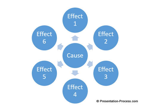
#1 Standard Diagram in SmartArt
The only option you will find is the diverging Radial diagram. It looks like this:
This diagram has probably been used many times in various presentations. You make this diagram look different by applying some effects.
#2 Radial Diagram with 3D
You can apply 3D effects to the above diagram to create a more attractive slide.
Here is how the Radial Diagram would look like, with 3D effects.

While this is still far better than the original SmartArt, let us explore more creative ways to represent Cause-Effect diagrams…
…by creating our own diagrams.
Designing Simple Cause Effect Diagrams
#3 Easy 2D Diagram
The simplest cause-effect diagram can be created by using Block Arrow shapes in PowerPoint. For example, by using 4 Right Arrows, and applying Preset effects, you can create this basic diagram.
![]()
This is a simple diagram. The same set of arrows can be changed into…
#4 Diverging Block Arrows Diagram with 3D Effects
With 3D effects this diagram can look completely different:
![]()
You can view the tutorial to create this diagram here >>
In this case, we used standard block arrows. As a next step, you can…
#5 Create Your Own Arrows
You can play with the shapes available in PowerPoint to create your own arrows.
Here is how we created a custom arrow shape by merging an arrow and rectangle shape..
![]()
Diagrams with these kind of arrows look completely different. Here is a slide with a diagram created with these custom arrows:

You can find step by step tutorial to create these custom arrow shapes here >>
This is just one option. You can create any number of variations.
Here is another custom arrow shape we used to create a 3D diverging arrow diagram
![]()
And the diagram that can be created from this arrow….

These diagrams are fun and easy to create.
However if you need a formal cause-effect relationship to be shown, you may want to present…
Formal Cause Effect Analysis with Fishbone (Ishikawa) Diagram
#6 Easy Fishbone Diagram
A Fishbone diagram is made up of connecting lines and rectangles. Here is an example:

This video provides step by step instructions on how to create this diagram in PowerPoint. If your diagram does not have as many points, you can be more creative with it.
#7 Creative Fishbone Diagram Ideas
If you’d like to go beyond the ‘usual’ then it is possible to present with diagrams like these:

Source: PowerPoint 2 CEO Packs Bundle
These diagrams showcased here are from our ready to use template bundle. You can download free samples from the CEO Pack here.
These type of creative diagrams are more likely to attract and retain your audience attention.
So let’s move to the last section with some really different and creative ways to present Cause Effect Diagrams…
Diagram With Creative Metaphors
We’ll go beyond just analyzing the effect and represent the ‘type’ of effect with these diagrams.
#8 Showing one effect impacting the next with Domino Effect

This diagram is simple and easy to create and shows the ‘real’ impact of an event. You can view this tutorial video to learn how to create this diagram.
If you are creating a strategic presentation and want to show how there is an increasing impact, you can use…
#9 Increasing Impact With Ripple Effect Diagram

Click here for tutorial on creating this diagram.
#10 Tree Diagram showing concept of Cause and Effect
A tree is a beautiful representation of ‘cause- effect’ relationship. The natural structure of a tree makes it easy to represent the ideas with a clear demarcation. See the following example:

You can find more creative Tree diagram ideas here >>
So that is 10 different ways in which you can present your cause-effect analysis!
Do you have more creative ways in which you have presented a Cause-Effect diagram? Do share with us in the comments section below.
All the templates showcased in this post are taken from PowerPoint 2 CEO Packs Bundle.
If you’d like to find 1500+ more creative option to make over your presentations – fast, Click here