Home > Presentation of Data Page> Excel Charts in PowerPoint
You do not always need to use PowerPoint to present charts within PowerPoint. You get a much better flexibility when you use Excel to create your charts and paste them in PowerPoint. You can easily handle a large amount of data in multiple worksheets to create your chart in Excel. Whereas, the chart features in PowerPoint are still quite basic. In this article, we will take a look at some of the key things to remember while creating a presentation using Excel Charts in PowerPoint.
Tip #1 : Provide a clear conclusion
Audience watching a PowerPoint presentation and someone going through an Excel file on their own are in two different mindsets.
When you present your information using PowerPoint the inference from the chart has to be clear and explicit. The audience doesn’t have the patience to go through the details to make their own conclusions.
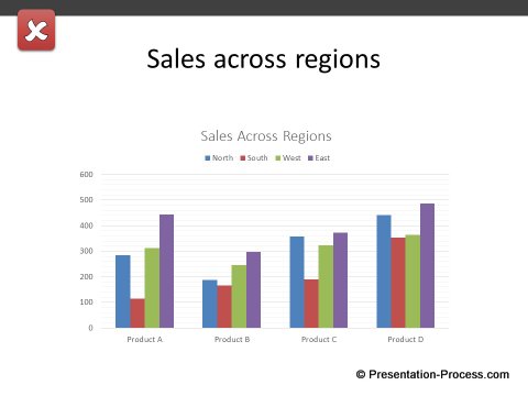
Here is an example of a chart with an unclear conclusion.
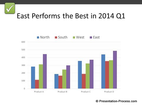
 Here is an example of the same chart, with clear assertions.
 Related: Know more about effective slide design using Assertion and Evidence in your slides.
Tip #2 : Cut down the fat
Use the power of Excel to cut down the fat.
- Remove unnecessary data points.
- Break the information into small, digestible chunks before making your chart.
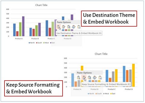
Once you finish making your chart, you can copy the chart and paste it in PowerPoint using the destination theme and embed the workbook or you can keep the source formatting in Excel as shown below:
Tip #3 : Use Recommended Charts feature
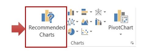
Excel makes it easy for you to select the right chart to visualize your numbers. For example, when you select your data in Excel and go to the ‘Insert’ tab, you will see an option called ‘Recommended charts’ in the ‘Charts’ group.
 When you click on the option you will have the following dialog box open up:
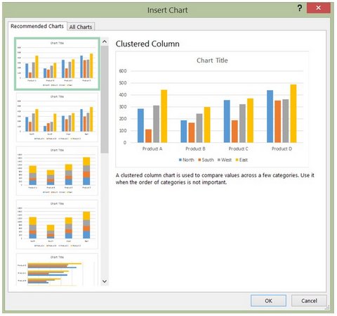 The pane on the left shows you thumbnail preview of the various chart options. When you click on any of the options, you can read a brief information about the chart type and when to use the type. This helps you select the right chart for your presentation.
When you create your chart directly in PowerPoint, you may not be able to preview different chart options so quickly.
Related: How to select the right chart to present your data.
Tip #4: Link Data to keep the chart updated
When you copy the chart from Excel and paste in PowerPoint, make sure that you link the data to Excel. You can choose to ‘Use Destination theme and link data’ to keep the formatting of the destination or ‘Keep source formatting and link data’ to retain the formatting in the Excel file.
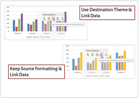 This way your PowerPoint file gets updated when the linked data in Excel gets changed. To update the chart with linked data in PowerPoint, right click on the chart and click on ‘Edit data’.
You may like : How to animate Excel chart in PowerPoint
Tip #5: Paste as picture to protect your charts
Sometimes you may have to present the same chart over and over, with the latest numbers updated. In such cases you can create your chart in Excel, copy it and paste it in PowerPoint as picture using ‘Paste Special’ function. This allows you to keep using the same worksheet to update your data in Excel. The added bonus is, you don’t have to worry about the recipients manipulating your charts later.
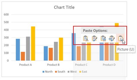 Remember you can apply all the options in Picture formatting to the Chart image you just pasted.
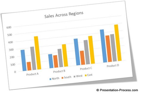 Those are some of the things to remember when you use Charts from Excel in PowerPoint.
Another option for business presenters:
Content is the king in all business presentations. However, the content should look attractive to grab the audience attention. One way to make your slides look attractive is to use high quality graphics and diagrams on your slides.
Quick Note:
If you are a business presenter who wants to make remarkable charts without wasting time, we have an elegant solution for you. We recommend you take a look at our ‘Visual PowerPoint Graphs Pack’.
The pack has more than 320 business relevant chart templates that are super easy to use. In fact, all the charts you saw in this article are taken from the pack.
![]() Please take a look at the gallery page to see the range of pre-formatted creative PowerPoint charts from the pack.
Please take a look at the gallery page to see the range of pre-formatted creative PowerPoint charts from the pack.
Why waste your valuable time constructing charts from the scratch, when you have such an elegant solution available off the shelf?
Related: Setting right animation for charts
Return to main Data Visualization section
Return to Top of Excel Charts in PowerPoint Page
