Home > Presentation of Data Page> Performance Graph Templates
Add meaning to your performance related graphs by comparing values against a target range. Discover ideas to make your data charts more memorable.
A Common Data Presentation Mistake:
In data presentations, many presenters make the mistake of showing their performance figures without setting a clear context to those numbers. So, the audience loses interest in the details and switches off.
In this article, we will show you examples of how you can present your performance numbers in relation to a given target range. Remember, it is the context that makes the numbers meaningful and your charts memorable.
1. Graph Templates with Max, Min & Preferred Target Range:
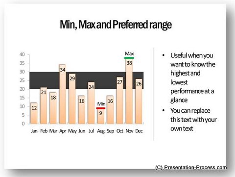
Take a look at this PowerPoint chart:
Related: Minimum Maximum Values Graphs from Visual PowerPoint Graphs Pack
A black band which shows target range of 20 to 30 helps audience get the significance of performance numbers for each month. They can easily see the months where the performance has been up to the expected standard and also the months where the achievement has been less than desirable.
Of course, the template provides additional context to the numbers by showing minimum and maximum values.
2. Conditional formatting in Graphs:
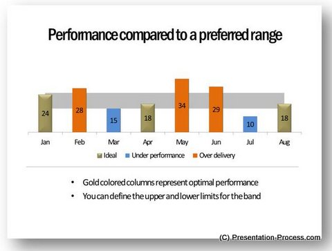
Take a look at this conditional chart:
Source: Performance Against Target Graphs
The chart not only has target range to set context to numbers, but also has conditional formatting applied to columns. The orange colored columns show over delivery, blue columns show under performance andgold columns show ideal performance.
So, the audience doesn’t have to ‘think’ to get the message. Naturally, the chart is memorable.
3. Varying target range in graph:
Sometimes, you wish to present actual numbers versus forecast numbers. So the target band varies each month. Here is an example template that captures the scenario neatly:
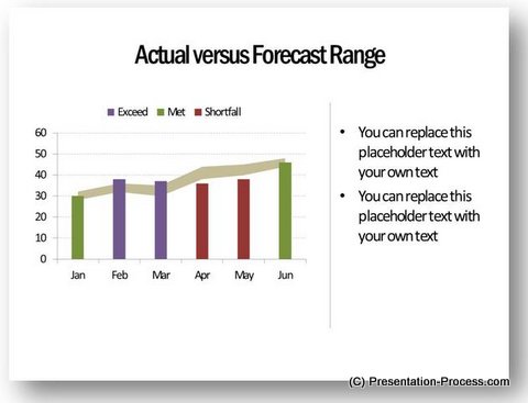
The conditional formatting of columns makes the chart easier to grasp.
4. Comparison against multiple performance bands:
Sometimes, a single target band may not be enough. Here is an example that shows multiple performance bands.
- Three performance bands:
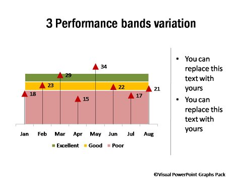
The chart shows the range for Excellent, Good and Poor.
- Variation of multiple performance bands:
Sometimes, you may want to show a number of data points set against performance range. Colored bands at the background may distract audience attention. Here is a simple alternative to depict the data:
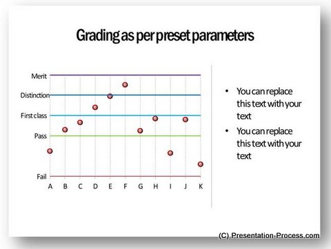
Inference:
So, the next time you want to show your performance numbers see how you can add meaning to your graph templates by including a comparison target range at the background.
Related: Power Up Your Line Charts with trend lines
Readymade solution to save you time:
Creating charts with insights takes time. If you are a busy business presenter, we have a readymade solution that not only saves you valuable time, but also makes your data slides look professional.
Please browse through our collection of visual PowerPoint graph templates. The pack has more than 320 ready made chart templates, which are professionally formatted and are 100% data driven. The templates are super easy to edit. All the example chart templates shown in this article are taken from the pack.Take a look at our chart gallery.
Why waste time creating your data charts from the scratch, when you have such a high quality solution available off the shelf?
Related: Box and Whisker Plots Template Ideas
Related: 5 Exciting Line Chart Templates
Return to Top of Performance Graph Templates Page
