
Home > Presentation of Data Page> Info Graphics in PowerPoint
Use creative infographics to show percentage composition in PowerPoint. Find creative ideas that make your message memorable.
Using Info graphics in PowerPoint:
Charts in PowerPoint need not be boring. You can combine the visual tools of PowerPoint and Spreadsheet capabilities of Excel (embedded in PowerPoint) to create stunning charts that grab and hold your audience attention.
In this article, we will take a look at some interesting chart ideas to express percentage composition using the above method. The charts you see in this article are fully editable data driven chart templates. They are commercially available as part of our ‘Visual PowerPoint Graphs Pack’.
Here are some examples of data visualization from different industries:
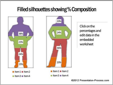
Silhouettes showing Percentage composition in a marketing presentation:
There are times when you want to convey brand preferences of Men and Women separately for your product lines. The usual 100% stacked column chart may not be as interesting as this info graphic in PowerPoint:
 Related: How to represent innovative Poll Results
Using relevant visuals as backdrop:
Let’s say you want to show percentage composition of your bottled drink. Instead of showing the usual stacked column chart, you can use the image of a bottle to serve as a visual backdrop for your chart:
![]()
Source: Percentage Composition – Data-Driven Graph Templates
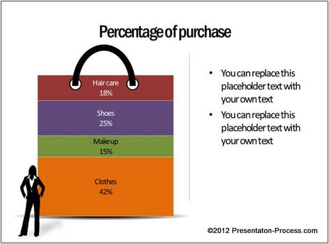
Using Visual Metaphors as backdrop for your data chart:
Let’s say you want to present information about the type of purchases made by a customer and the percentage composition of those items. You can use the visual metaphor of a shopping bag to convey the idea as follows:
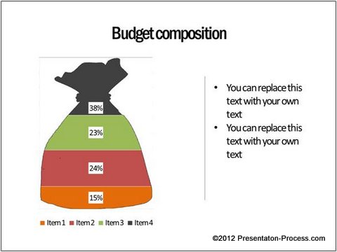
 You can show % composition of budget by using money bag as a metaphor:
 Stunning visual appeal by using PowerPoint:
The advantage of creating these cool info graphics in PowerPoint is – you can use the unique tools of the software to add sheen, shadow or reflection to your chart graphics:
Source: Percentage Composition – Data-Driven Graph Templates
It is not easy to create this visual appeal by using chart functions in Excel alone.
Inference:
The next time you want to create a data presentation, consider creating your info graphics using the tools in PowerPoint. It is worth your time and effort to make a lasting impression on your audience.
Sometimes, when you want to create a business presentation in a hurry, you can’t spend the time it takes to create these info graphics from the scratch. That is why we came up with our ‘Visual PowerPoint Graphs Pack’. The pack has more than 320 business relevant data driven Graphs and Info graphics in PowerPoint.
In fact, all the templates you saw in this article are taken from the pack.
To edit the charts in the pack, you just need to replace sample data with your own data in the embedded worksheet. The charts update themselves automatically. Click here to take a look at the demo for the pack.
Related: See how to create your own Pictograph in PowerPoint