Home > Presentation of Data Page > Line Chart in PowerPoint
You can get a lot more out of your PowerPoint line charts than just showing changes in data over time. Discover the hidden features that take your charts to the next level.
Use line charts in PowerPoint to forecast performance:
Most presenters use line charts to just visualize trend over time. There are a whole set of features in PowerPoint that allow you to get more juice out of this useful chart type. Let us explore a few:
Power of trend lines:
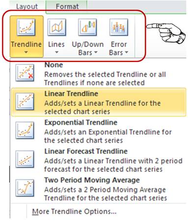
First draw a basic line chart using your data points. Now, go to ‘Layout’ tab in PowerPoint ribbon. You will find these useful options on the top right corner:

Here are a few things you can do with these hidden features:
1.Forecast breakeven point without breaking a sweat:
Take a look at the following example:

Source: Line Charts for PowerPoint from Graphs Pack
We plotted revenues and costs of a company over time, using line chart. We used ‘linear trend line’ option to forecast the breakeven point. A simple line chart in PowerPoint transformed into a useful business forecast tool in a few clicks.
2.Compare your projection figures with a linear trendline:
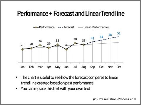
Sometimes we tend to be optimistic in our performance projections. When we compare our projection values with a simple linear trend line (which is calculated based on the past performance), we see the real picture. Take a look at the following example:

Source: Visual Graphs Pack
The blue dotted line shows our projections. The straight line is our linear trend line. The difference shows if the projection is too optimistic.
Related: 5 Small Mistakes in Presenting Data
3.Evaluate the consistency of your performance using moving averages trend line:
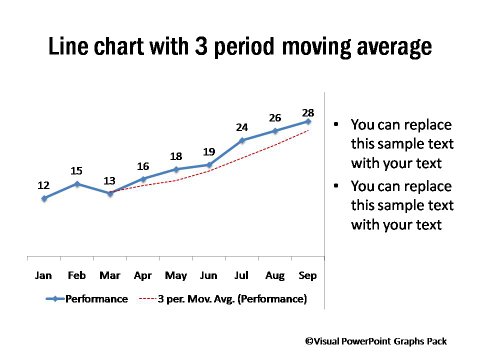
You don’t need to use just a linear trend line. You can see how your performance compares to the average of the three most recent periods. Take a look at the following example of a line chart in PowerPoint:

It shows that the performance has been consistently above average.
While the above may not be an exhaustive list of things you can do with the chart options in PowerPoint, we hope that the examples would have set you thinking in the right direction. Take the time to explore the different options in PowerPoint line chart type and use the full range of features to visualize your data.
Another way to get more chart options:
If you are a business presenter, we wish to share with you a useful resource that helps you visualize your data with impact. The product is – ‘320+ Visual PowerPoint Graphs pack’. The pack has more than 320 preformatted data driven chart templates in PowerPoint.
Here are some examples from the Graphs Pack…
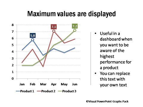
Maximum Values in Different Trend Lines Displayed

Source: Minimum and Maximum Values Display
Highlighting Performance During an Event

Source: Performance Before / After Event
Clearly Indicated Values of Target Less Performance

Source: Charts Showing Target & Performance Gap Values
The pack is designed keeping in mind a business user. The templates not only save you time, but also make your data slides look professional. Please browse through our complete collection of Visual PowerPoint graphs pack here.
Why waste time formatting your charts when you have a useful solution available off the shelf?
Related: Pie Chart in PowerPoint – 3 Big Issues and Solutions
Related: Do Your PowerPoint Graphs tell a Story?
Return to Top of Line Chart in PowerPoint Page
Return to Main Presentation of Data Page
