Home > Presentation Design > Minimal Slide Design
Keep your presentation slide simple and practical. See the Slide Design Makeover example using our proprietary Minimal Approach here.
Since slides in PowerPoint are meant to serve as support to the speaker, instead of being the lead attraction, it is essential to keep their design simple and practical. In fact, a slide with good design blends in with the message completely.
Let us take a regular business PowerPoint slide and see how we can make it simpler and better by following ‘Minimal design’ principles.
Here is the complex slide design that we will try to improve:
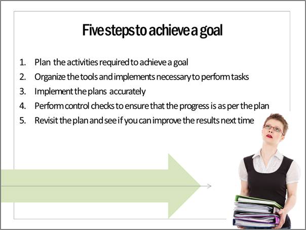
The slide looks quite attractive. If it had been a page in a magazine, it would have definitely attracted the reader to go through the page. But, since it is a slide in a business presentation, it attracts too much attention to irrelevant areas of the slide.
Removing the unnecessary design elements…
So, let us remove the pictures which seem to just decorate the slide instead of conveying any specific message. The slide looks as follows:
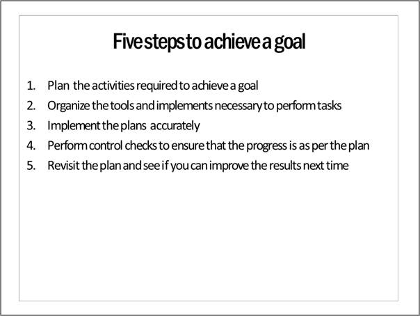
The audience attention is now brought back to the main part of the slide.
Now, as we go through the slide, we realize that there is too much text on the slide which can be verbalized by the presenter.
Removing the excess words…
So, we remove the fluff and keep just the keywords on the slide. The slide now looks like:
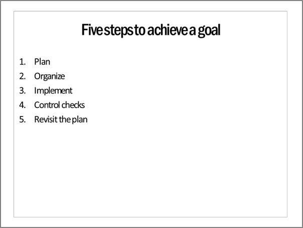
Though the slide has just the essential text to convey the message, the message is not memorable.
Adding a simple visual context to the message:
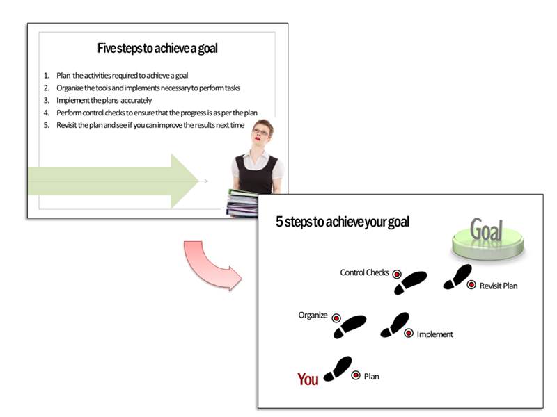
Since the slide talks about the steps to reach a goal, we will use the metaphor of footsteps that take a person from current place to the end goal. The slide now looks like:
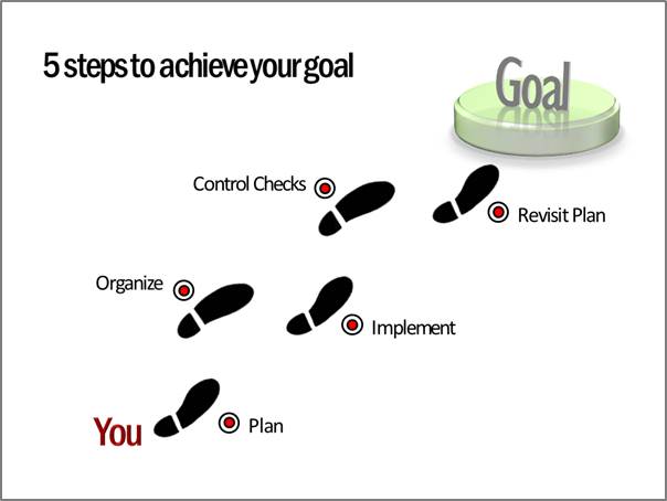
Of course, we need to add custom animation to the slide to explain the idea better.
First, the slide shows just ‘YOU’ and ‘GOAL’ with a large gap in the middle. This allows the presenter to set the context of the presentation – which is about bridging the gap between the current state and the end state.
Then each step appears on a click. This allows enough time for the presenter to elaborate on the points. Thus, we converted a busy ornate slide into a simple, visual slide in no time.
The madeover Minimal slide design
When we realize the real objective of a slide, it is easy to have a good slide design.
Sometimes, we may find it difficult to get the right visual context for our message. No matter how much we rake our brains, ideas just don’t flow. In such cases, it is helpful to have a handy reference of concept slides to get inspiration from.
We recommend you take a look at our ‘750+ PowerPoint Charts and Diagrams Pack for CEOs’. The pack has tons of interesting, original and creative ideas to help you visualize any business concept you can imagine.
What is more, the diagram templates are super easy to use. Once you choose the diagrams that capture your message, copy them to your slides and replace sample text. Your professional presentation gets ready in minutes.
Here are some samples from the pack:
PowerPoint Success| Growing Towards Goals
Goal Achievement | Animated Arrows Showing Alignment to Goals
Creating business presentations has never been easier. Please browse through our diagrams collection now and see how the pack changes the way you create business presentations forever. See the Goals Concepts and More from the Pack here >>
Related: Layout Lessons from Financial Newspapers
Related: PowerPoint Designer Best Practices from Websites


