Find examples of 5 creative organization charts in PowerPoint. Say good bye to the boring org charts with these interesting options.
Who says Organization charts in PowerPoint should be boring?
Are you tired of these boring organograms that are inbuilt in your presentation software?
Your audience surely is bored of these hierarchy diagrams.

There are many options to represent organizational hierarchy in PowerPoint. But, the problem is – most of them are pretty dull and overused.
Practial Issues with Smartart
There are some practical issues in using SmartArt diagrams for hierarchy in your business presentations. Here are some:
- Managing font sizes in a SmartArt Org chart is tiresome. Since SmartArt decreases font size of your text to maintain the size of your text boxes in the chart, you usually end up with some awkward looking text boxes that have small fonts in big text boxes
- There are no options to include photos of the staff that makes your organization charts memorable
- It is not easy to portray matrix relationships or level wise relationships with SmartArt
In this article, we will show you some interesting ways to represent organization hierarchy. You’ll see how it pays to go completely creative and fresh in representing these relationships.
| All the example templates you see in this article are part of our 750+ PowerPoint Charts & Diagram templates for CEOs. The pack contains everything required for a business presentation from Arrows, Business Concepts, editable graphs and charts. All the templates are completely editable and comprehensive. |
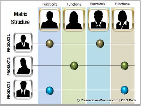
1. Representing matrix relationships
Relationships in an organization are complex. For example, a product line may have reporting responsibilities to multiple functions or vice versa. The usual charts are inadequate to capture these complex relationships.

That is why you need to go beyond the usual representations. A matrix structure like the one you see above comes in handy to represent matrix relationship.
Related: From boring table to a visual PowerPoint Diagram:
An Example
Note: You can replace the silhouettes with photos of the staff. You can replace text with your own. You can copy paste elements to add or delete lanes. You can adjust the position of the markers.
2. Representing level wise relationship:
Sometimes you need an option to represent different levels in your organization. You may want to talk about access permissions for your database, approval authorities for different projects or time duration to move across levels.
A template like this will help you present the information easily and effectively:

Source: Org Charts from PowerPoint CEO Pack
The template is professionally animated to allow you to explain each level at the click of a mouse. As with any other template in the pack, you have complete flexibility to add or remove levels by copying elements.
3. Introducing team members
Take a look at the following diagram representing org sructure:

This unique diagram shows staff positions at each level, and introduces each team member at different levels.
You would see that the options combine an understanding of business and cutting edge design principles.
Related: 5 Creative Ways to represent PowerPoint Tree
4.Showing team wise distribution
Sometimes teams are distributed around specific objectives or projects. The following template allows you to depict that relationship in a straight forward way:

5.Showing career path
A hierarchy chart need not always be linear. Sometimes breaking the convention helps you come up with interesting variations on Organization Charts in PowerPoint like this one:

Source: Organization Hierarchy Charts from PowerPoint Charts CEO Pack.
You can download free templates from PowerPoint Charts & Diagrams CEO Pack,
by clicking here
Conclusion about Organization Charts in PowerPoint:
A slide representing Organizational chart is very common in HR presentations, Pitch books or Investor presentations.
You need options that capture your specific situation clearly and elegantly. Don’t be constrained by the ‘usual’ representations. Break the mold and think afresh.
Related: Tutorial to Create Stairs Diagram to represent Hierarchy
Find More Tutorials for Presentation Graphics
Return to Top of Creative Organization Charts in PowerPoint Page
