Presentation Process | Creative Presentation Ideas

Get Creative PowerPoint Ideas to Makeover Your Business Slides from Presentation Process

  • Home
  • Articles
  • PowerPoint Training Courses
  • PowerPoint Templates Packs
  • LOGIN

Graphs Showing Performance Against set Range

Part of : 320+ Visual PowerPoint Graphs Pack

Widest Variety of Data-Driven Graphs & Infographics for PowerPoint


Performance Comparison to a Defined Target Range
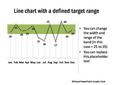
Performance Comparison to a Defined Target Range

Description:

These Performance charts helps you show the data points that fall within a preferred range and those that don’t. You can change the width and range of the band. There are graphs with multiple bands, which can be used to showcase poor, average and excellent performances.

Audience get a quick view of the performance points that need attention. The band gives a clear context to the numbers. These are useful in any Marketing, Manufacturing, Education related presentations as they show forecast or targets vs actual achievement.

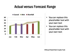
2 PowerPoint Graphs showing Performance vs Preferred Range
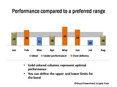
Performance vs Preferred Range Actual vs Forecast Range

4 Different Performance Bands and Achievements

4 Different Performance Bands

3 Performance Bands and Achievements
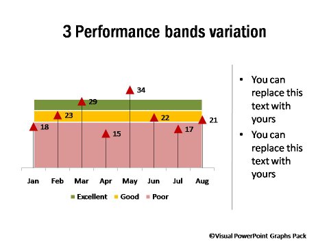
3 Performance Bands and Achievements

Minimum & Maximum Performance & Preferred Range Highlighted
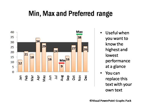
Minimum and Maximum Performance and Preferred Range Highlighted

Graph in PowerPoint showing Merit Grading as Per Preset Parameters
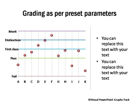
Merit Grading as Per Preset Parameters

Note: All the bands, descriptions, grades can be changed in the worksheet.

Related Templates from Graphs Pack:

Sales Reporting Charts

Sales Reporting Charts

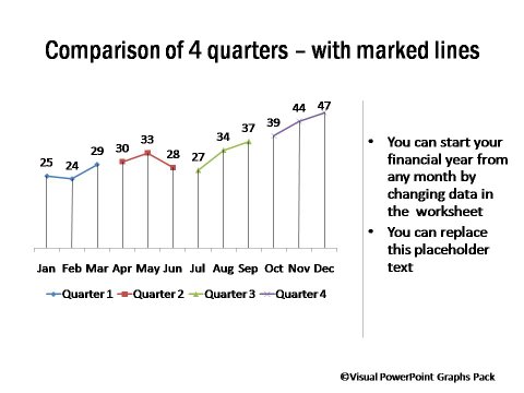
Performance Across Quarters

Performance Across Quarters

NEXT STEPS:

Go to Gallery of Visual PowerPoint Pack View Demo of Visual Graphs Pack Pricing of Graphs Pack

Share this:

  • Click to print (Opens in new window)
  • Click to share on Facebook (Opens in new window)
  • Click to share on Twitter (Opens in new window)
  • Click to share on Pinterest (Opens in new window)
  • Click to share on LinkedIn (Opens in new window)
  • More
  • Click to share on Reddit (Opens in new window)
  • Click to share on Tumblr (Opens in new window)
  • Click to share on Pocket (Opens in new window)

Please Share Your Comments & Suggestions


Secured by PayPal

Key Features of Graphs Pack

  • Huge Variety of 320+ Graphs
  • Easy to Use & Edit
  • Completely Data-Driven
  • No Additional Software required
  • Get New insights from data

Browse All Graphs
in this Pack

NAMED CHARTS

Box Plot
Bullet Charts
Gantt Charts
Marketing Funnel & Pyramids
Pareto & Histograms
Speedometer Charts
Step Charts
Waterfall Charts
Thermometer Charts
Yes / No & Butterfly

DATA-DRIVEN INFOGRAPHICS

Handdrawn Charts
Percentage Completion Dials
Chart Placeholders
Pictographs
Visual Pie Charts
Currency Composition
Percentage Completion
Percentage Composition
Poll Result

FUNCTIONAL CHARTS

Dashboards
Conditional Charts
Min Max Values
Winners Underachievers
Project Management Charts
Surplus & Deficit
Sales Reporting Charts
Total & Composition

Performance Compared

Before & After Event
To Specified Range
To Target
Across Products
Across 2 Years
Across Quarters
With Gap Highlighted

ESSENTIAL CHARTS

Bar Chart
Column Chart
Line Chart
Bubble & Area Charts
Pie Charts
Pie Chart with Details
XY Scatter & Radar
 

OTHER

Download Samples

  • HOME
  • About Us
  • Contact Us
  • Privacy Policy
  • Terms of Service
  • Affiliates
  • Login
  • DMCA Protected

Copyright © 2010-2019 · Presentation-Process.com · All rights reserved ·
If you get inspired by any of the free material we post, we'd appreciate a link to the article in your Blog or website or Facebook ·

Copyright © 2019 · BDhire Presentation Process Theme on Genesis Framework · WordPress · Log in