Home > Presentation of Data Page> PowerPoint Speedometer
Discover 5 Different and Creative Speedometer chart templates to be included in your business presentations. Make your data slides remarkable with this useful chart type.
A quick word about PowerPoint Speedometer:
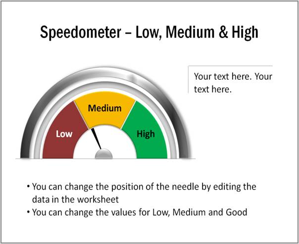
A speedometer chart uses the visual metaphor of speedometer to compare performance values against predefined set of qualitative parameters. It is a useful chart to include in performance dashboards.
A typical speedometer chart looks like this:
 1. Basic application of Speedometer chart:
A typical speedometer chart used in performance dashboards gives a quick visual cue about whether the performance for the period has been Good, Poor or OK.
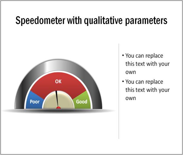
Source: Data-Driven Speedometer Charts from Visual Graphs Pack
In this article, we will explore a few ideas that widen the application of the charts in business presentations.
2.Using the chart to present scenario analysis
Instead of using the chart just as performance indicator, you can use it in strategic presentations to present scenario analysis. For example, take a look at the following slide
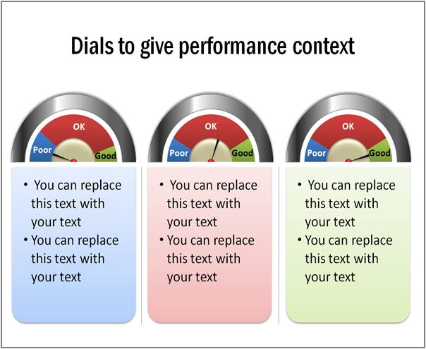 You can use the chart template to explain your strategy in poor, good and excellent scenarios. When you carry the same dials forward in your dashboards, monthly performance figures automatically get a strategic context.
Related: 3 Creative Ideas for Strategy Diagrams
3.Indicating percentage completion
When you make slight alteration to the dial, you can use the chart in project presentations to indicate percentage completion. Take a look at the following PowerPoint Speedometer:

See More Percentage Completion Charts
You can reduce the size of the data driven chart and use it as a data button.
4.Using the chart for Balanced Score Card:
You can create a visual balanced score card template when you assign a dial for each of the four quadrants. Take a look at the following example:
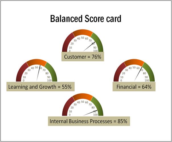
Source: Data-Driven Speedometer Charts from Visual Graphs Pack
You can have this slide made for different units in your annual reports. The simplicity of the dial gives a quick overview of the performance to even the last person in your organization.
5. Using the chart for Project Reporting:
Here is a simpler version of PowerPoint Speedometer chart that indicates percentage completion of three phases:
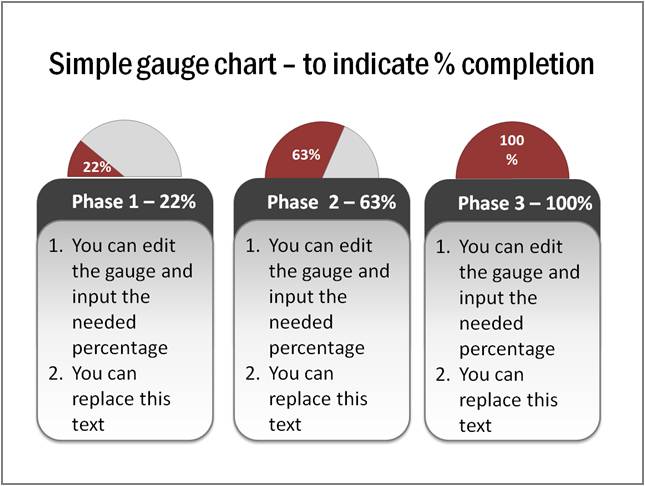 The charts are not only informative but also are aesthetically appealing. So, you can use them in your internal magazines, newsletters and intranet sites.
Easier option for busy business presenters:
While a speedometer chart is elegant, it takes a lot of time and effort to create the chart from the scratch. That is why we came up with out ‘Visual PowerPoint Graphs Pack’. The pack has more than 320 business relevant data driven chart templates in PowerPoint. The charts are super easy to edit. Take a look at the demo page to see the proof.
The pack includes every chart type imaginable. All samples in this article are from the pack.
Why waste time creating your business charts from the scratch when you have such a high quality solution available off the shelf?
See Visual Graphs Pack for PowerPoint >>
