Home > PowerPoint Slides > Clarity in Presentation of Data
In this article, we’ll learn about the fourth parameter for slide evaluation, which is about clairity in presentation of data and information. Before we learn about the parameter…
Here is the structure to make an effective PowerPoint slide:
• The purpose of a business presentation is to influence your audience to take a decision.
• Each presentation is made up of a BIG decision with smaller decisions.
• These decisions can be influenced with assertions and evidence.
• We evaluate the effectiveness of a slide based on the clarity of assertion and the clarity of evidence.
• The golden principle for a visual slide is – One slide: One assertion.
Setting the context for clairty in presentation of data:
Every element in a presentation should lead the audience to make the BIG decision. Here is a visual representation of the way the various elements in a presentation lead to the BIG decision:
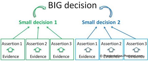
Your presentation will be successful, when you make the path towards the BIG decision as smooth and clear as possible for your audience. For this, you need to make the inference from your slides obvious.
Reference: See this article on how to present data creatively.
Why should the inference be obvious? The answer is…
Lack of guidance is frustrating for your audience.
Take a look at this slide:
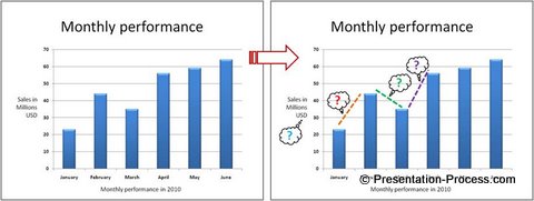
Though the chart gives the right information, the inference from the slide is not obvious. When there is no clarity in presentation of data, different people in the audience start looking at different parts of the chart and raise questions. The discussion goes off on a tangent and the presenter loses control of the situation.
Consider this alternative representation of data in the graph:
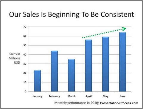
This slide title clearly spells out the message of the slide. The specific portion of the chart which proves the assertion is clearly highlighted using a green dotted arrow. The audience ‘gets’ the message in seconds and moves towards the BIG decision.
How do you bring in clarity in presentation of data?
The first way is to use contrast to highlight the important information.
You can choose to use a different color to bring attention to the important point of your slide, or highlight the main point with a red line or use any method that makes the audience notice the information you want them to register in their mind.

Let us see how we can enhance the clarity of a data presentation slide:
In the following slide, the presenter wants to showcase that their new system has saved costs across all units.
So, the right data to show is the cost comparison between previous year (when the system was not available) and the current year (with the new system).
The information is captured in the following slide:
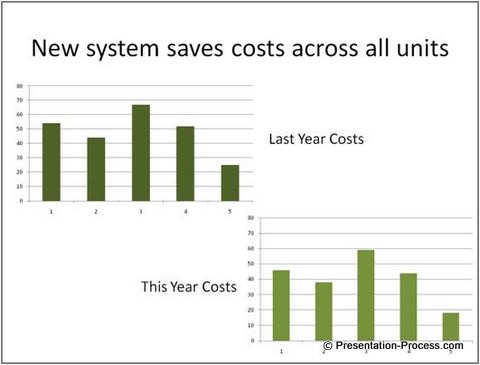 Though the two charts used in the slide provide the required data, the inference is not obvious. Here is a better alternative:
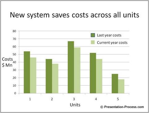
In this, both the charts of the previous slide are combined to help the audience read the information easily. This definitely improves the clarity of the information provided. But, the inference is not made obvious enough.
Here is a much better alternative of presenting the graph with clarity
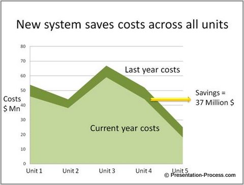
The information is provided in a clearly understandable form. The exact amount saved is mentioned on the slide in a very obvious way.
Reference: You can read more about how to present data better here.
This is the extent to which you may need to bring in clarity in presentation of data.
Such clarity should be present in all the elements on a slide:
For example, you can make the visuals in your slide obvious by focusing only on the relevant aspects of the pictures. Consider this example:

The presenter wanted to talk only about a certain part of the circuit. So, only the specific part of the circuit was magnified to make it easy for the audience to follow. The thumbnail picture of the overall circuit was retained to show how the zoomed area relates to the rest of the circuit.
Consider another example of presenting a process in PowerPoint:
The slide is meant to explain the process of making bread.

For sake of clarity, instead of showing the full picture, we focus the audience attention to just the relevant portion of the picture. This makes the message obvious and memorable.
Common reasons why presenters don’t have clarity in presentation of data:
1. They make wrong assumptions
This is especially common in technical presentations. Presenters assume that their audience is like them. They feel surprised when the audience can’t understand the ‘basic’ acronyms of their industry.
Solution:
If you want to avoid this problem, get a reality check by running your presentation past one of your audience members before you present to the entire group. This helps you avoid basic mistakes caused by unreasonable assumptions.
2. Information blind spot
If you know a lot about your subject, you lose the ability to imagine how it would be to ‘not know’ the information you know. This is called the curse of knowledge. It is impossible to avoid this blind spot.
Solution:
Show your presentation to someone who doesn’t understand your subject as well as you do. See what kind of questions they ask you. That should give you some clues about what information to include or remove in your presentation.
Reference: More on how to understand your audience and approach your presentation here.
3. Missing basics
Most unclear presentations are due to missing basics.
Solution:
Check if these basics are in place.
• Is there a clear ‘BIG decision’?
• Are the small decisions leading to BIG decision?
• Are the assertions supporting the small decisions?
• Is there a clear evidence for every assertion?
• Is the key message on each slide presented as a visual?
• Is the information built in small incremental steps?
If the answer is ‘yes’ to all the above questions, there is very little chance that your audience can’t get your message.
Conclusion:
If you want your audience to spend their time evaluating the BIG decision, instead of ‘making sense’ of your information, you should make sure that there is clarity in presentation of data.
Recommendation:
Most of the information we say here in these articles might sound obvious and intuitive. But, it is not easy to execute visualization strategies in your slides without sufficient guidance.
We wish to recommend you an invaluable book called Visual presentations – from text-based slides to simple and powerful diargams in 3 easy steps’.
The book teaches you a simple 3 step process to communicate your ideas visually. There are tons of examples to ensure that you understand every minor aspect of visualizing your information as clearly and completely as possible.
If you are serious about improving your business presentation skills, the book is a ‘must have’ tool for you.

Get Your copy of Visual Presentations here and change the way you present…
Mode:Download on purchase
Format: Adobe PDF
File Size:5 MB
Print Length:104 pages
Usage License:Single User, Personal License
Publisher:Presentation Process.com (May 2011)
Language:English
30 days Risk-free Money Back guarantee
Pay safely using your Credit Card or Paypal account and download the file instantly.
Price: US$ 24
Note: Your billing statement will show a charge from PAYPAL*PRESENT Once your purchase is processed successfully, you will get the “Visual Presentations” eBook download link right away.
Found this article useful?
If you find value in this article on clarity in presentation of data, we urge you to recommend this free high quality e-course to at least 3 of your friends. Please take time to explore the rest of the site and bookmark it. If you are a business presenter or trainer, you’ll find tons of useful information in the site.

