Home> Presentation of Data > Target Versus Performance
Discover creative ways to compare Target against Performance in your business presentations. Go beyond the usual data tables and make your charts visual.
‘Target versus Performance’ charts are common:
One of the common requirements in data presentations is to show performance of a unit versus the target assigned to the unit. There may be variations in the way information is presented. Here are a few examples of business situations and the relevant chart variations:
- In business plan presentations – projected versus actual revenues
- In finance related presentations – budget versus actual costs
- In marketing presentations–performance versus benchmark for customer acquisition
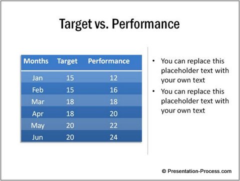
Most presenters choose the easy route of using data tables to show the information. Thus, a typical slide showing ‘target versus performance’ looks like this:
 Though the table looks ‘beautiful’, it is not easy for the audience to visualize the information. Let us see some interesting ways to visualize the information.
The data driven chart templates you see in this article are from our ‘Visual PowerPoint Graphs Pack’. The idea is to inspire you to come up with your own variations.
1. Equalizer Chart Comparing Performance to Benchmark

Source: Performance Charts from Visual Graphs Pack
The chart above gets its name from its resemblance to graphic equalizer in a music system. Each dash represents a unit. Benchmark is constant.
You can use the chart to represents scores in a survey.
2. Walls and Arrows Chart
The following chart template not only allows you to show performance compared to set benchmark, but also allows you to include the name of the topper for the month.

Source: Performance Charts from Visual Graphs Pack
You can use the chart to report sales performance of a small team.
3. Using 3D Column Chart Variation
 Here is a simple cluster column chart that shows performance compared to target. Targets are shown as boxes and performance figures are shown as cylinders for easy distinction.
While 3D charts with tilted angles are quite difficult to understand, simple ones with clear data labels (like the one you see here) are easy to follow.
4. Combination Chart

Source: Performance Charts – Graphs Pack
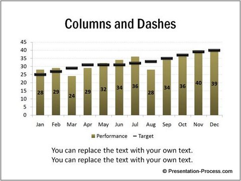
This is another variation of a combination chart in PowerPoint.
It is visually easier to identify values that exceed target in the above chart. We have included clear data labels for columns. This helps audience read the numbers easily. We have also included y values to read the target figures accurately.
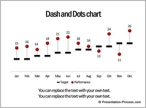
5.Info graphics style Dashes and Dots chart
The following chart gives you surplus and deficits in one quick glance:
 The look and feel of the chart is simple and clutter free.
Related: PowerPoint Info graph with Shopping Bag Icon
Inference
The next time you want to show target versus performance, go beyond the usual data tables. Help your audiences understand your information and take decisions.
It takes a bit of expertise in spreadsheet software to create the above chart templates. Creating charts in Excel and sticking them on PowerPoint slides is clumsy, because when you edit the data, the charts go all over the place.
An effective option to make stunning charts without wasting your valuable time:
A simple way to make stunningly visual charts, even if you have no expertise in Excel is – to go for our ‘Visual PowerPoint Graphs pack’.
All the charts shown in this article are from the pack.
The pack has more than 320 high quality; business relevant charts. All the charts are created using PowerPoint. So, you just need to replace our sample data with your own data. The charts update themselves automatically.
Please take a look at our demo videos to see how easy it is to work with our charts.
The Chart gallery, shows an amazing range of charts to help you visualize data in every business situation imaginable.
Why waste time structuring your data driven charts from ground up, when you have such an efficient and effective solution available off the shelf?
