Home > Presentation Design > Visual Information Makeover
Present your new concept or idea in Visual form instead of as boring text. See the power of setting the context with a diagram before providing details to your audience.
Visual Information challenge:
If you are a business presenter, you would have realized by now that it is not easy to explain a new concept or idea to an audience. No matter how good you are with your words, you can’t avoid losing a few people in the room. In fact, the more you talk – the more you confuse the audience.
The reasons for the confusion are:
- The way you see your idea is not the way your audience sees it. They don’t have the context you have
- Your audience may not know your subject as deeply as you know it
So, they can’t visualize the relationship between your thoughts as easily as you do. Result – they either understand you wrongly or switch off.
What is the way out?
Draw your concept. Make it visual and see the bulbs glowing in your audience’s faces.
You don’t have to be a Da Vinci or Michelangelo to sketch your thoughts. Visualizing an idea has more to do with your thought clarity than about your drawing skills.In this article, we will see a simple makeover of a concept slide and realize the power of idea visualization.
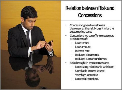
Here is the ‘usual slide’ we will work on:

Here are our comments on the slide:
- While the use of a high resolution photo makes the slide look attractive, it doesn’t help audience understand the content of the slide any better
- The slide appears too busy with tons of text. This can put off the audience fast
- Audience can’t visualize the relationship between concessions and risks even after going through the slide fully
Let us see how we can organize the information and visualize the relationship to make the slide visual.
Step 1: Establish the core relationship using a simple diagram
Diagrams are easily the most effective way to explain the relationship in a concept. If we take our example case, the relationship between risk and concessions can be visualized as follows:

This simple diagram shows – ‘Extent of concessions given to the customer reduces as the amount of risk brought in by the customer increases’.
Related: Visual Idea: Recurring Theme with 3D Pill
Step 2: Flesh out the details
Once you establish the core relationship with your diagram, you can flesh out the relevant details. In this case, the details are – the type of concessions we offer and the kind of risks brought in by the customer.
So, the revised slide would look like:

Remember, it is the context that lends meaning to details.
So, whenever you want to explain a new concept to your audience, take a little time to draw the core concept first. Stay there till you feel confident that everyone in the audience‘got’ the relationship shown in the diagram. Then and only then you add details.
This simple trick should help you explain any new idea more effectively to your audience.
You may also like: Visual Diagram Idea: Amazing Signal
You may also like: 3 Steps For Information Visualization
Return to Top of Visual Information Makeover Page
