Home > Data visualization > Waterfall Chart in PowerPoint
Discover variations of Waterfall charts you can create in PowerPoint. Find the chart that suits your specific requirement for your business presentations.
Quick word about Waterfall Chart in PowerPoint:
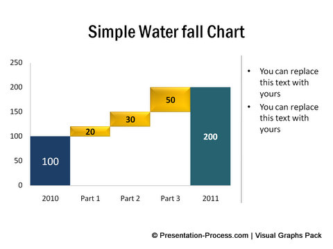
According to Wikipedia, “A waterfall chart is a form of data visualization that helps in determining the cumulative effect of sequentially introduced positive or negative values”.
Take a look at the example shown above. The increase in revenues from 2010 to 2011 is accounted by three contributing parts.
Different names of Waterfall graphs:
Waterfall chart is also known as Flying Bricks chart because of the way different blocks seem to be suspended in air. Here is an example of the chart:

The chart is also known as Mario Chart due to its resemblance to the popular game. In finance, the chart is called as Bridge chart. Let us see some useful variations of Waterfall diagram.
Net Profit Waterfall Chart
Here is an example of the chart:

The chart shows the break-up of different costs to arrive at gross and net profits from Total revenue.
The chart is taken from our Visual PowerPoint Graphs Pack. It is super easy to edit this visual chart. Just right click on the chart and go to Edit data. An Excel Worksheet opens up as shown below:

Enter your own values in the yellow cells. The graph updates itself automatically. It is that simple. You can insert new rows to add more expenses. You can edit the labels as you would do while creating an excel chart. The 320+ Graph templates in PowerPoint make chart creation in PowerPoint totally effortless.
Cash Flow Bridge Chart:
Here is another variation of Waterfall chart in PowerPoint. This bridge chart shows cash flow variations across a time period:
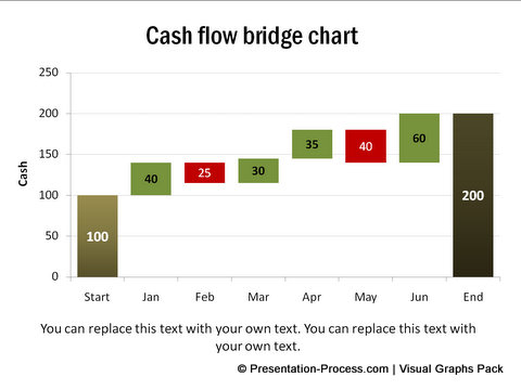
Positive cash flows are shown in green and negative cash flows are shown in red. The colors are pre-designed in the charts. When you open the embedded worksheet you will see the following:
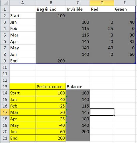
You just populate the yellow cells with your numbers. The rest will be taken care of by the graph template. Creating professional looking graphs and info graphics has never been easier.
Related: Ideas for presenting Performance Reports
Smarter Option for business presenters:
It takes a lot of time and effort to create Graphs in PowerPoint. If you create graphs in Excel and stick them on to PowerPoint slide, you can’t edit the graphs directly in PowerPoint. Moreover, the formatting goes all haywire.
As busy business presenters you may not have the time to wrestle with various options in PowerPoint to create professional looking charts. That is why we came up with our ‘Visual PowerPoint Graphs Pack’. The pack has more than 320 graphs and info graphics in PowerPoint. There is every type of graph you can imagine, already created for you to just replace numbers.
Here are some sample chart and info graphics templates from the pack:
 |
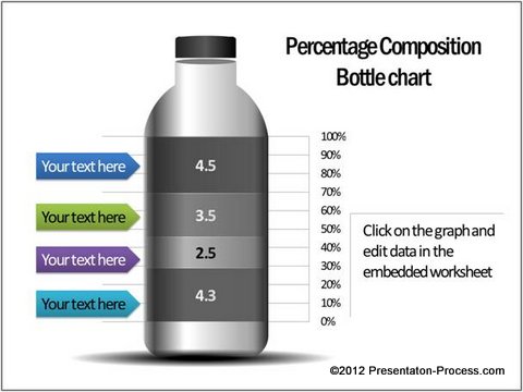 |
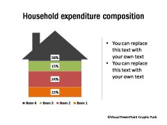
Source: Percentage Composition Charts from Visual Graphs Pack
 |
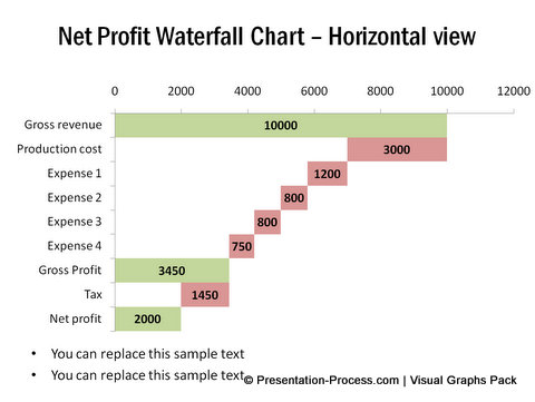 |
Source: Data Driven Waterfalls from Visual Graphs Pack
You don’t have to struggle with formatting the graphs either. All the graphs are professionally formatted for business presentations. Please watch the demo of our Visual PowerPoint Graphs Pack here. You can also download samples to test the ease of use.
It is probably one of the wisest investments you can make, if you are into creating PowerPoint presentations for your business. Please browse through our chart templates and see how Visual PowerPoint Graphs Pack can change the way you create your business charts forever.
Related: Speedometer chart Ideas
