Home > Presentation of Data > Charts in PowerPoint
Are your charts in PowerPoint not getting you results? You may be using the wrong charts to convey your message. Learn how to make your point with impact using the right charts in presentations.
Choose a chart that gives you the most meaningful inference
We don’t want to waste your time discussing the basics of choosing the right charts to represent your information.
If you follow these rules, you are already on the right track:
- Pie chart to represent proportions
- Line chart to represent trends
- Column chart or Bar chart to represent ranks under different conditions
This article tells you how you can get better insights by going beyond your obvious choice.
By exploring different relationships between numbers you may come up with some surprising insights that spur your audience into action. Here is an example:
Context of chart used:
One of our clients wanted to compare the sales performance of their brand versus the performance of two competing brands in the market. They operated in a niche where almost all the sales were accounted for by just these 3 brands.
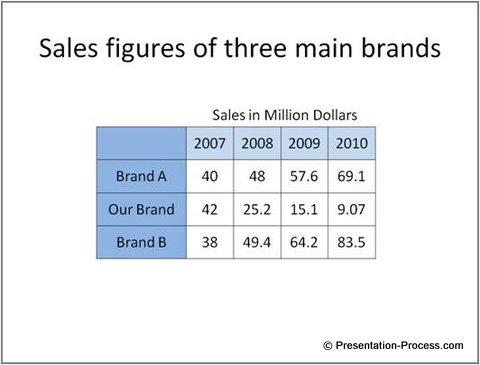
Take a look at how the information was presented in their slide:

This data table didn’t give any meaningful information. Though the numbers were relevant and accurate they didn’t tell the audience what to look for.
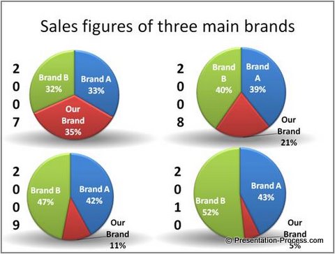
So, we suggested them to represent the information in a visual form. They took our suggestion and presented the information using pie charts:

The slide definitely looked impressive. The pie charts helped the audience see how the three brands were placed in the market for the past 4 years. Though the glitz and glamor of the data presentation may distract the audience, the depiction was much better than a cold listing of the numbers in a table.
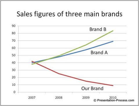
While this was all the information they wanted to convey, we urged them to dig deeper to explore the sales performance of the three brands over the years. So, they used a line chart to see the relationship:

The lines clearly told the story. The sales of Brand A and Brand B had been on the rise, while Brand C had been on the decline from 2007. This line graph added to the information provided by the 4 pie charts.
The client was quite surprised at the trend. They always knew that their brand had been on the decline, but the magnitude of the decline shocked them.
Another way of looking at the data…
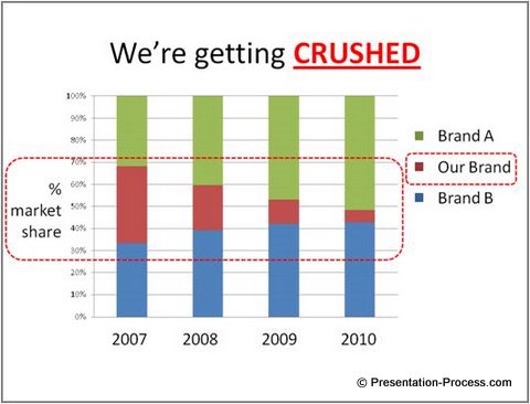
We weren’t still satisfied with the results. We wanted to see if we could get a better insight by combining the information from the pie charts and the line graph. So, we asked our client to capture the change in proportion of the three brands over the 4 years using 100% stacked column chart. Here is the result:

The chart made the message loud and clear and met their presentation objective. It showed that Brands A and B were eating into their market share. They realized that if the trend continued, they may be wiped out in a year’s time.
They immediately took the necessary steps to revive the brand.
Conclusion for better charts in presentations:
Most presenters don’t take the time required to process the data to the extent needed. They limit their analysis, which affects the effectiveness of their message.
So, don’t stop processing your numbers till you get a clear and meaningful inference. Try different alternatives to analyze your numbers. Explore relationships that are not immediately obvious. Your effort may yield surprising results.
An easy solution for business presenters:
Looking at finding easy and ready to use graphs for delivering insights in your presentations? Browse our Visual Data-Driven Graphs Pack for PowerPoint
Return to Top of Right Charts in PowerPoint Page

