
Home > Presentation of Data Page> Creative PowerPoint Charts
Find creative data-driven PowerPoint Graphs to compare performance for two periods. See how some simple tweaks can lead to remarkable charts that convey your message effectively.
Charts to compare performance for two periods:
In any business presentation it is common to compare performance for two periods. Comparison could be in terms of performance, rankings, market share etc.
Many presenters use plain data table to list down values for two corresponding periods and expect the audience to make their own inferences. Naturally audience switches off on seeing such tables and the presentation ends up getting ignored. In this article we will show you some interesting options to compare performances across two periods.
Using different chart types:
When we compare performance values, it helps to show the distinction in the two data series as clearly as possible. Take a look at the following chart template that compares performance for four quarters over a two year period:

Source: 2 Period Comparison Charts from Visual Graphs Pack
We used a line chart and area chart to make the distinction. We also allowed a gap between the quarters to make it easy for the audience to read the values.
Related: Using Combination Charts Effectively
Using same chart type
There are times when you want to use the same chart type to show values for both the periods. For example, take a look at the following chart template:
 In this chart, we wanted to show the increase in revenues due to adding a new product to the existing range. The values for the new product are shown in a different color. We used clustered columns to show the comparison.
Related: Ideas for Visual Metaphors in Chart
Using innovative options:
Sometimes it helps to bring in spruced up creative PowerPoint charts in your presentations. For example, in the following chart template, we used cluster bars to compare person-wise performance for two periods:
 We used different shape fill options to create arrows with different colored heads facing different directions. The red arrows facing left show drop in contribution and the green arrows facing right show increase in contribution by different people over two periods.
Take a look at the following chart template that shows change in revenues for two periods:
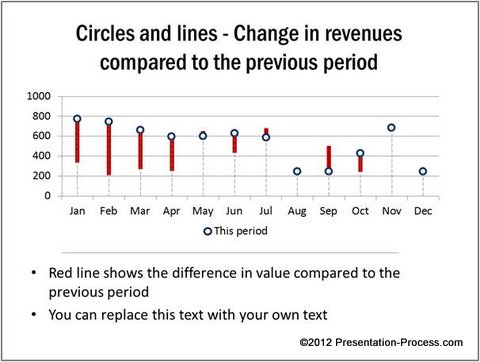
Source: 2 Period Comparison Charts from Visual Graphs Pack
We used drop lines to show the difference. The lines above the circles show the increase in revenues and the lines below the circles show the extent of drop in revenues.
Related: Creative Performance Report Ideas
Smarter option for business presenters:
With a bit of imagination and skill it is possible to create charts that grab your audience attention and make your message memorable. However, creating such charts takes a lot of time and effort. Most business presenters are too busy to invest the time required to make such insightful charts.
Quick Note:
If you are a business presenter who wants to make remarkable charts without wasting time, we have an elegant solution for you. We recommend you take a look at our ‘Visual PowerPoint Graphs Pack’.
The pack has more than 320 business relevant chart templates that are super easy to use. In fact, all the charts you saw in this article are taken from the pack.
![]() Please take a look at the gallery page to see the range of pre-formatted creative PowerPoint charts from the pack.
Please take a look at the gallery page to see the range of pre-formatted creative PowerPoint charts from the pack.
Why waste your valuable time constructing charts from the scratch, when you have such an elegant solution available off the shelf?
Related: Creative Charts in PowerPoint To Compare Market Share
Return to Top of Creative PowerPoint Charts for Performance Page