Home > Presentation of Data > Make Data Presentation Sticky
Your presentation efforts go waste if your audience can’t recall the key numbers in your data presentation correctly. Learn the 4 ways to make your key numbers stick in your audience’s mind.
It is far more difficult to remember numbers than words
The reason is, words trigger relevant visuals in your audience’s mind which help them register your idea. Numbers unfortunately don’t trigger any such imagery like a visual presentation. So, most of the numbers in your presentation are quickly forgotten by your audience.
What is the trick to make your numbers stick?
 The trick is to make your audience visualize the context of your numbers, instead of just the digits. The deeper they get the context, the longer they retain the information in your data presentation. The question is…
How to make your audience remember the context of your presentation data?
The simple solution is to add as many perspectives to your key numbers as possible.
There are many ways to give additional perspectives to your key numbers. Here are the 4 ways that are commonly used by great presenters:
1. Shrink the timeline:
“We lost 4300 customers last month” doesn’t seem as shocking as “We are losing a customer every 10 minutes”. Somehow 10 minutes seem here and now compared to 1 month.
“3.575 Million People die of water borne diseases every year” doesn’t trigger audience emotions as deeply as “A child dies every 20 seconds due to water borne diseases”. The image of a child creates powerful emotions and puts the number in context.
Action step to present data:
Think about how you can make your key numbers relate to your audience by shrinking the timeline. Talk about the change that happens in a day or an hour.
2. Stretch the timeline
“An average American uses 160 gallons of water everyday” may not mean anything. However, a statement like, “If you continue to use 160 gallons of water each day, central Florida may run out of clean water in the next 5 years” makes people sit up and listen.
“The small amount of money you spend on Latte every day, can help you retire rich if you invest carefully (called the Latte factor)” is the crux of a Best seller book on Financial investment.
It is possible to make your audience realize the magnitude of your numbers, if you stretch the timeline.
Action step to stretch time in data:
Think about the long term impact of your numbers. Make your audience visualize the future. Learn to make your presentation sticky.
3. Add the dimension of space
A vending machine sales person relates money to space to persuade shop owners to lease his vending machine. He spreads a small piece of cloth (5’X5’ dimension) on the floor and says, “This small 25 sq.ft space in the corner of your shop can generate $1000 in profit every month”
A teacher explains the number of neurons in the brains by saying, “There are 100 billion neurons in our brain. If we arrange them lengthwise, they can extend from Charlotte to Boston”. The kids get the idea immediately.
Adding the dimension of space makes big numbers relate easily.
Action step to make data easy to relate:
Think about how you can relate your numbers to space. You can think of many ways in which to present your data creatively.
4. Make the data relate to their everyday life
When a presenter mentioned that 2.5 billion people in the world don’t have access to improved sanitation, no one in the audience seemed surprised. When she rephrased it as, “There are more cell phone users in the world than people who have basic sanitation facilities” the truth dawned on them.
Action step to put the data presentation in context:
Think about how you can relate your numbers to your audience’s everyday life
Conclusion about using data in presentation:
Numbers don’t mean anything to your audience. But, the message the numbers convey matters a lot. So, let your audience visualize your numbers. Let them dream it. Let them touch it and let them feel it around them.
You don’t have to dramatize every number in your presentation. Just choose the key numbers you want your audience to remember and think about how many perspectives you can add to put the numbers in context. You’ll be surprised at how well your message sticks.
Smarter options for business presenters:
Our Data-Driven PowerPoint Graphs Pack is an easy option for busy presenters. We have done all the hard work for you. The pack has everything from regular charts like bar, pie, line charts to unique and creative data-driven infographics to help you get across your business information easily.
Take a look at some of the pre-formatted templates from the Graphs pack here
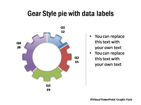
Gear Style Data-Driven Pie Chart

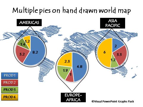
Hand Drawn World Map with Pie Call outs


These graphs are surprisingly easy to use and don’t require any additional software or extensive PowerPoint knowledge. You just need to copy our graphs to your slides and replace your data in the worksheet.
It is so easy to present insights to audience with such graphs.You can now do away with confusing excel sheets and tables. Please do browse through the gallery of 320+ high-quality graphs for business presenters here >>
Related: Do Your PowerPoint Graphs Tell a Story?
Return to Top of Make Data Presentation Sticky Page
