Home > Presenting Data Main > 5 Data Presentation Tips
Most data presentations are confusing and boring. Learn the 5 tips to make your presentation clearer and more memorable.
Tip 1: Put your conclusion on the title
Most presenters use vague slide titles like Our Sales Performance. This doesn’t give the audience any clue about what to look for in the sea of numbers presented on the slide.
Always put the conclusion from your slide on the slide title. Since your audience naturally scan your slides top down, a clear title helps them find your key message fast.
See this table of data on a slide:

Since the conclusion is clearly mentioned on the title, audience’s eyes are naturally led to the relevant numbers on the table.
Tip 2: Highlight your inference
A lot of presenters lose their audience because they make them think. They expect their audience to do mental math and draw their own conclusions. Since most audiences prefer to switch off than to process complex information, data presentation gets quite tricky.
Realize that not everyone in your audience likes to crunch numbers. Most of them expect you to do the math and tell them the inference. Highlight the inference so clearly that there is no scope for confusion for your audience.
See the PowerPoint slide with clear graph below:

The areas that depict losses and profits are highlighted clearly in different colors.
All that is left for the audience to do is to read the conclusion on the title and see the proof (assertion-evidence method) in the body of the slide to move forward.
Tip 3: Use images to make your message more memorable
Sometimes in a data presentation, numbers can be cold and intimidating. Using relevant images can make your information more inviting.
See the following slide with map showing data:

The picture of the world map helps the audience get a visual context for the 4 pie charts. Every time you put up some numbers on the slide, think about adding a relevant picture to add clarity to your message.
Tip 4: Use visual representation of numbers
You can make your column charts and pie charts come to life by using small icons to act as units for your chart.
For example, take a look at this column chart:

See Related Data-Driven PowerPoint Pictographs from Visual Graphs Pack
All we did was to copy a cardboard box and paste it multiple times one over the other. The chart got ready in seconds. You may copy-paste small icons specific to your industry to make your chart visual.
You don’t need to limit yourself to icons. Think about using other images to serve as visual clue for your numbers.
For example, take a look at this creative slide:

Related Data Driven Dials Showing Completion from Visual Graphs Pack
We used the picture of a clock and shaded the relevant portion to make our point. A clock makes it easier to visualize 15 minutes better than words. You can think of more creative ways of presenting data.
Tip 5: Present information in stages
Make it a habit to animate your charts before presenting them. It makes your numbers less intimidating and helps your audiences get more information from your charts.
In the following example, see how we present data in stages:

First the axes are explained. Then line graph of Product X is shown to make the base case. This is then followed by the line graph of Product Y. This helps the audience realize how the sales of Product Y fluctuates more than the sales of Product X.
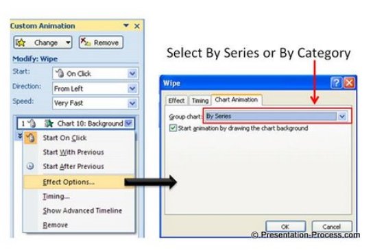
If you are not aware of chart animation feature of PowerPoint, here is a quick tutorial of how it is done.
PowerPoint Chart Animation Feature
First select the chart you imported from excel file. Go to animations -> Custom animation and select the kind of animation you want to use. This animates the whole chart.
Then, go to the custom animation menu and click on the drop down arrow next to the animation you selected. Go to Effect options and you will see a pop up box which gives you the option to choose chart animation.

You can animate your chart by Series or by category. This is extremely helpful to make effective data presentations.
Summary of 5 tips for better data presentation:
- Put your conclusion on the title
- Highlight your inference
- Use images to make your message more memorable
- Use visual representation of numbers
- Present information in stages
These tips make your data presentation effective and memorable.
Easy Option for Business Presenters:
Our Data-Driven PowerPoint Graphs Pack is an easy option for busy presenters. We have done all the hard work for you. The pack has everything from regular charts like bar, pie, line charts to unique and creative data-driven infographics to help you get across your business information easily.
Take a look at some of the pre-formatted templates from the Graphs pack here
Waterfall Charts with Brick Style Blocks from Graphs Pack

Yes and No Charts & Butterfly Charts

Jaws Chart Showing Performance Comparison Across Products

These graphs are surprisingly easy to use and don’t require any additional software or extensive PowerPoint knowledge. You just need to copy our graphs to your slides and replace your data in the worksheet.
It is so easy to present insights to audience with such graphs.You can now do away with confusing excel sheets and tables. Please do browse through the gallery of 320+ high-quality graphs for business presenters here >>
Related Article: Presentation on 3 Myths about Presenting Data
Related Article: 5 Examples of Visual Presentations using Analogy
Return to Top of Tips for Data Presentation Page
