Graphs Showing Performance Gap Values

Part of : 320+ Visual PowerPoint Graphs Pack

Performance Gaps Shown by Shaded Area

Performance Gaps Shown by Colored Area

In these charts the exact difference in values is displayed in the gap, the information is super easy to read. This collection provides pre-formatted PowerPoint graphs where you just need to enter your data.


Cost Savings Chart

Cost Savings Chart

Clearly Indicated Values of Target Less Performance
 Values of Target Less Performance

Unique Deficit Chart
 Deficit Chart

RELATED GRAPHS:
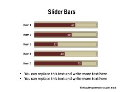
Performance Across Products  | Bar Chart Templates

Brand Performance Compared to Range and AverageSlider Bar Chart Template

NEXT STEPS:

Go to Gallery of Visual PowerPoint PackView Demo of Visual Graphs PackPricing of Graphs Pack

Visual Graphs Pack Home  | Features  | License Terms

Widest Variety of Data-Driven Graphs & Infographics for PowerPoint

Who Can Use this Pack?

  • Business Managers
  • CEOs  / CXOs
  • Partners / VPs
  • Sales Marketing Managers
  • Manufacturing heads
  • Department heads
  • Team Managers
  • Executives & more...

Key Features

  - Huge Variety of 320+ Graphs

  - Easy to Use & Edit

  - Completely Data-Driven

  - No Additional Software

  - Get New insights from data

Created by Experts
in both Business Presentations &  PowerPoint Design
awards won by Ram
Awards at work & Presentation Category Winner on Slideshare 2010

Easy to Edit Pptx Files

PowerPoint Logo

Virus Scanned(E-Scan)

Protection

PayPal Verified Seller

Paypal Verified

30-Days Risk Free

Risk Free Guarantee


Browse All Graphs
in this Pack


Download Graph Samples

Get Brochure PDF

Contact Us