Part of : 320+ Visual PowerPoint Graphs Pack
Widest Variety of Data-Driven Graphs & Infographics for PowerPoint
Dashboard Showing Change in Share Compared to Previous Period
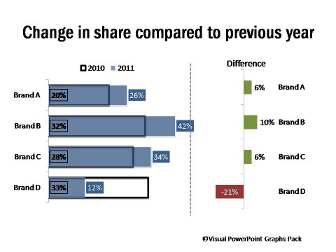
Description: When there are multiple related charts placed next to each – they help the audience understand the numbers in clear detail. While these are a defined set of charts, any of the charts from the Visual Graphs Pack can be used to create a custom dashboard.
|
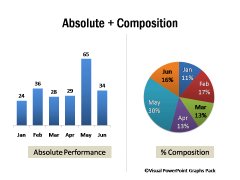
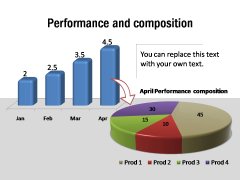
Absolute Performance & Composition Details
|
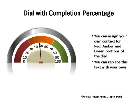
Project Progress Percentage and Reasons for Delays
|
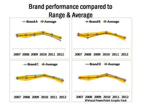
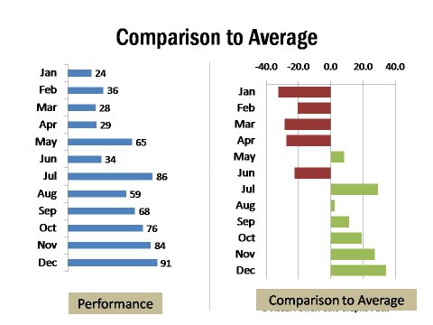
Pure Performance Data and Comparison to Average
2 PowerPoint Charts Showing Performance and Composition
 |
 |
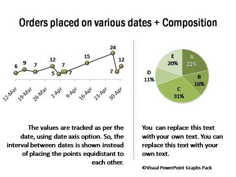
Orders Placed on Various Dates and Composition of Orders
Brand Performance Compared to Range and Average
