Part of : 320+ Visual PowerPoint Graphs Pack
Widest Variety of Data-Driven Graphs & Infographics for PowerPoint
Equalizer Chart Showing Performance on a Scale of 10
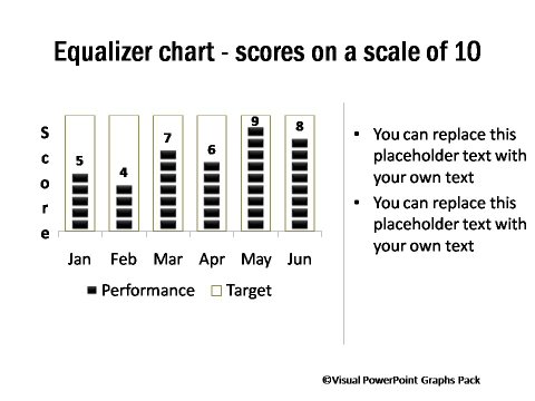
Description: These chart have a simple yet different look, making them ideal to be included in presentations, dashboards, internal magazines, newsletters etc. Each chart compares performance against set target and can be used in any presentation like budget, sales performance, manufacturing output, marketing presentation etc.
Graphs Showing Performance Bars against Different Targets
 |
 |
|
Target vs Completion Percentage
|
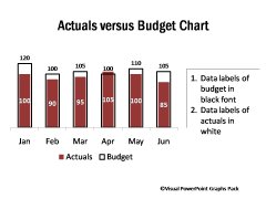
Actual vs Budget Chart for PowerPoint
|
Dashes and Dots Chart Showing only Target and Achievement

|
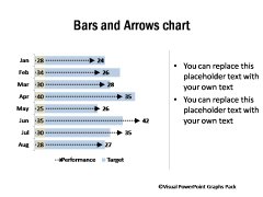
Bars and Arrows Chart for Presentation
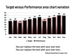
Target vs Performance Area & Column Chart
|
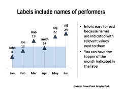
Performance for Each Employee in Detail
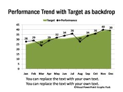
Performance trend line with target in background
|
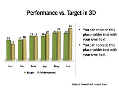
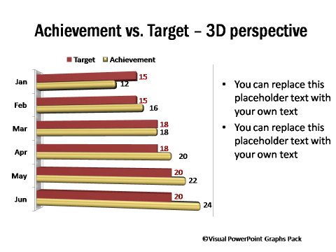
Achievement vs Target Bar Graph in 3D
Related Templates from Graphs Pack:
NEXT STEPS:


