

Microsoft PowerPoint for Microsoft 365 has recently introduced some interesting changes to its Design Themes. At first glance, one of the biggest differences is that there are fewer themes now. But there is more to the change than simply reducing the number of options.
The newer themes come with different layouts, more purposeful designs, and a more modern visual style. This is a welcome change because the themes now give you more useful starting points for creating your presentations.
Here are the three key changes you should know about.
Change 1: Themes Now Come with Their Own Layouts
This is probably the most significant change.
In older versions of PowerPoint, themes mainly changed the look and feel of your presentation. The standard PowerPoint layouts remained largely the same.
For example, if you went to Home > Layout, you would see the familiar PowerPoint layouts such as Title Slide, Title and Content, Two Content, and so on.
The newer themes work differently.
When you select a theme such as Orange Experience and then open the Layout menu, you can see a completely different set of layouts.
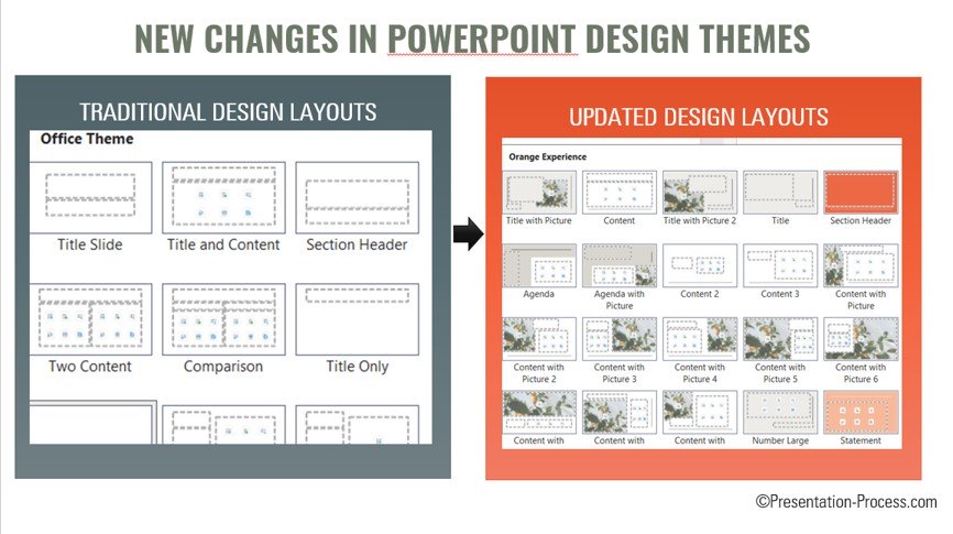
For example, you may find layouts such as Title with Picture or Content with Picture. These are not simply the standard PowerPoint layouts with different colors. They have been designed specifically as part of that theme.
You can select a picture placeholder, add an image from PowerPoint's Stock Images, and then add your own title and text.
The result is a slide that looks quite different from the traditional PowerPoint layouts, without having to design the slide from scratch.

You can also use the other layouts provided by the theme to create a consistent visual style across your presentation.
This is an important shift. Instead of thinking of a theme as simply a combination of fonts, colors, and backgrounds, you can now think of it as a collection of designed slide layouts as well.
Different themes can have different layout options
The same idea can be seen with other new themes.
For example, the Editorial theme has layouts that are different from those in Orange Experience. It even provides more than one option for some types of slides.
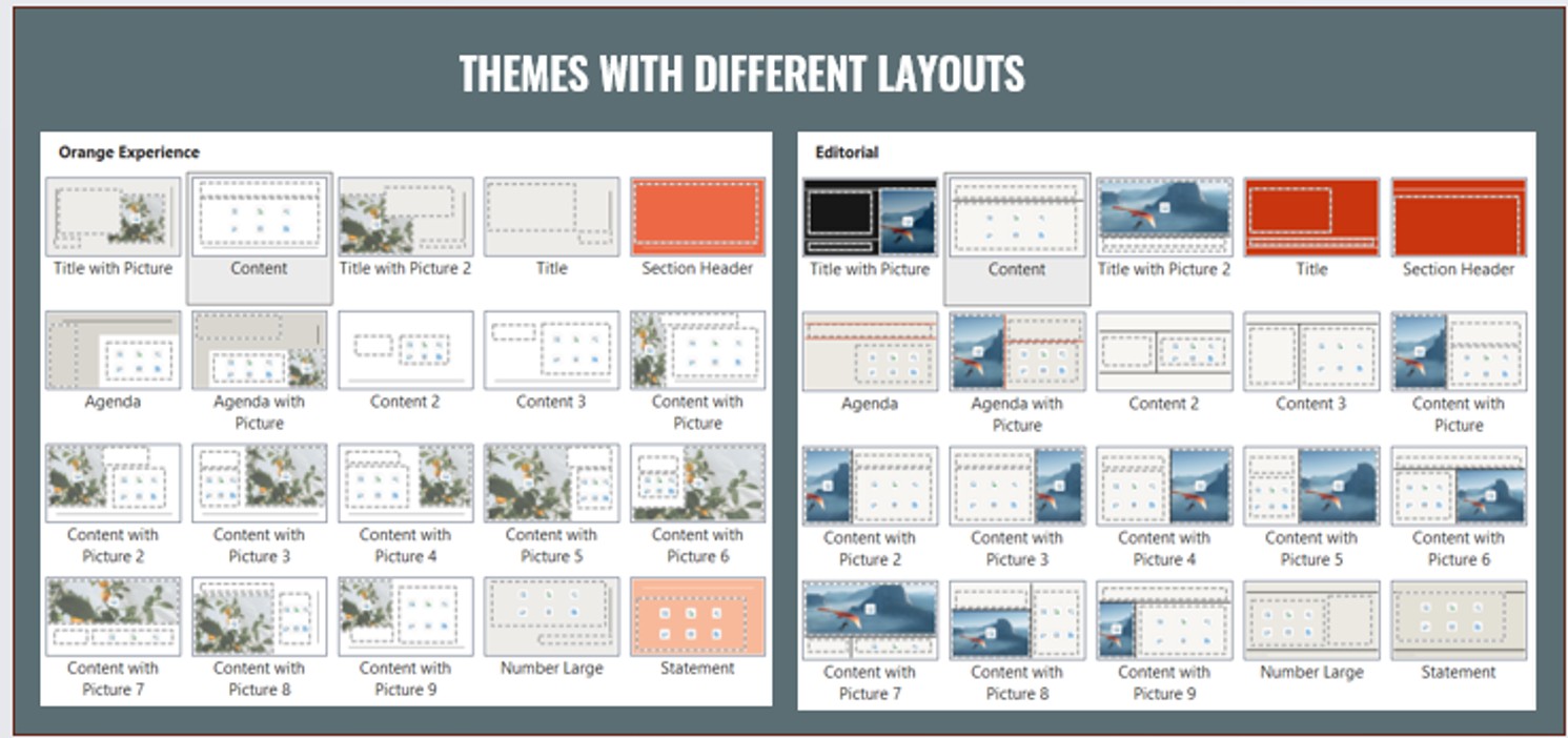
This means that choosing a theme at the beginning of a presentation can have a much bigger impact on the way your slides are structured.
Change 2: Themes Are Now More Purpose-Driven
Another change I like is that many of the newer themes seem to be designed with a particular type of PowerPoint user or presentation in mind.
In the past, many themes were fairly generic. They provided a visual treatment that could be used for almost any presentation.
The newer themes are more specific.
School Days for education
For example, School Days is clearly designed with teachers and education in mind.
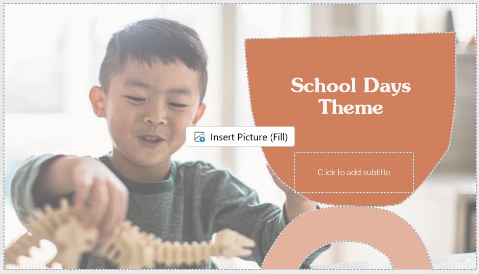
When you look at its layouts, you can see options that make sense for educational presentations. You can create a title slide, add pictures, and use layouts such as Agenda with Picture.
You could use a layout like this for a biology lesson, for example, and add an appropriate image from PowerPoint's Stock Images.
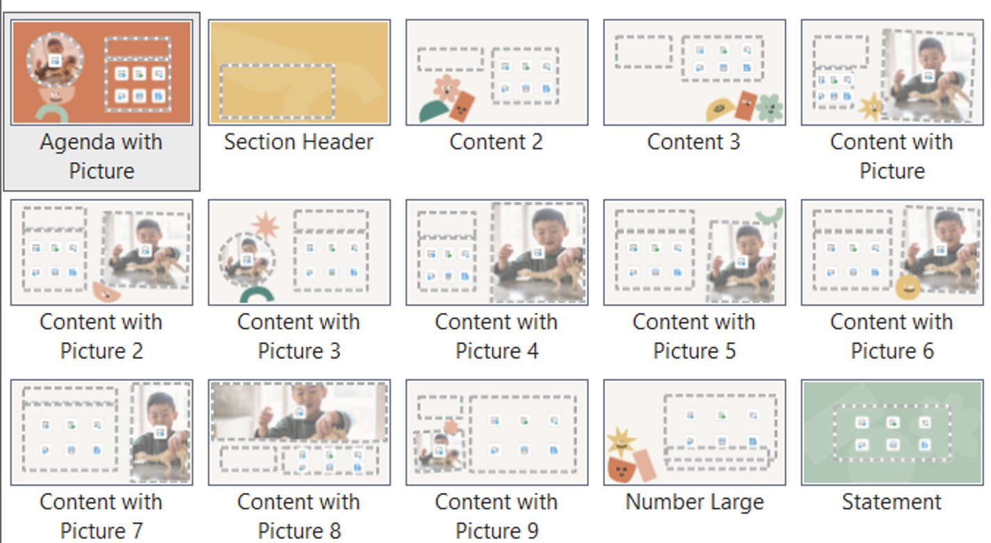
The result is more playful and visually engaging than simply applying a colorful theme to a standard PowerPoint layout.
There are also themes such as Film Burn, which provide a more colorful and vibrant visual style.
The important point is that Microsoft is no longer treating every theme as a generic visual skin for PowerPoint. The newer themes can give you a starting point that is better suited to the type of presentation you are creating.
Fewer themes, but fewer "empty calories"
You will also notice that the number of themes available in the Design gallery has been reduced.
I think this is a good thing.
Some older themes contained decorative elements that took up a lot of space without adding much value to the actual content. They looked different, but they did not necessarily help you communicate your message better.
I think of these as "empty calories" in a presentation design.
Microsoft appears to have removed some of those designs while retaining several familiar themes that users still like.
So although you have fewer choices, the choices that remain are generally more purposeful.
Change 3: New Themes Have a More Modern Visual Style
There is another change that you notice across many of the newer themes: they have a distinctly more modern look.
This can be seen in the fonts, colors, typography, and overall use of space.
Smaller default font sizes
One noticeable difference is the size of the text.
When you type text into some of the newer layouts and check the font size, you may find that it is smaller than what you would expect from traditional PowerPoint layouts.
For example, a text placeholder may use a font size of around 16 points.
Why might Microsoft have made this change?
One possible reason is the way presentations are now used.
Before the COVID-19 pandemic, many PowerPoint presentations were delivered in conference rooms, classrooms, auditoriums, and large meeting spaces. Today, a significant number of presentations are delivered online through platforms such as Microsoft Teams, Zoom, and Google Meet.
That changes the environment in which people view slides.
The smaller typography in these new themes may reflect this shift toward presentations being viewed primarily on screens.
Of course, this does not mean that 16-point text is appropriate for every presentation. If you are presenting to a large audience in a room, you still need to consider viewing distance and readability.
More modern color palettes
The newer themes also use color combinations that feel more contemporary.
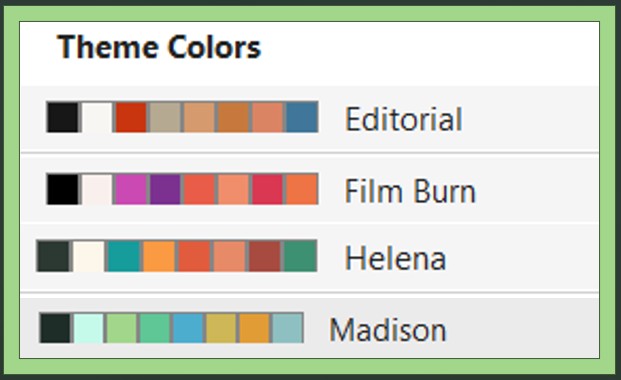
The colors are generally more carefully coordinated with the overall design rather than simply providing several variations of the same theme.
Fewer variants
You may also notice that many of the newer themes do not provide the three or four variants that were common with older PowerPoint themes.
Some older themes still have these options. For example, if you select a legacy theme such as the Office themes, you can still find the familiar variants.
But with many of the new themes, there are fewer variations.
This appears to be part of the broader change: rather than creating one basic design and then offering several cosmetic variations, Microsoft is providing a smaller number of more deliberately designed themes.
What Happens If You Change the Theme Later?
The new layouts raise an interesting practical question.
What happens if you create a slide using a layout that is unique to one theme and then decide to change the theme?
Will you lose the layout?
Fortunately, you don't have to worry about that.
If you create a slide using one of the new layouts and then apply a different theme, the content and basic layout structure are retained.
You can then select another theme.

You can try several different themes, and the slide structure remains in place.
This is useful because it means you can experiment with the new themes without worrying that choosing a different theme later will completely destroy the work you have already done.
You Can Still Customize Your PowerPoint Theme
Despite these changes, PowerPoint remains highly customizable.
You are not limited to the themes that Microsoft provides.
You can still create your own theme by customizing the fonts, colors, and other theme settings.
The new Microsoft themes should therefore be seen as starting points, rather than restrictions.
If you understand how PowerPoint themes, layouts, and the Slide Master work, you can still create and customize your own presentation system.
If you want to understand these features in more detail, our guide to the PowerPoint Slide Master goes much deeper into how themes and layouts work.
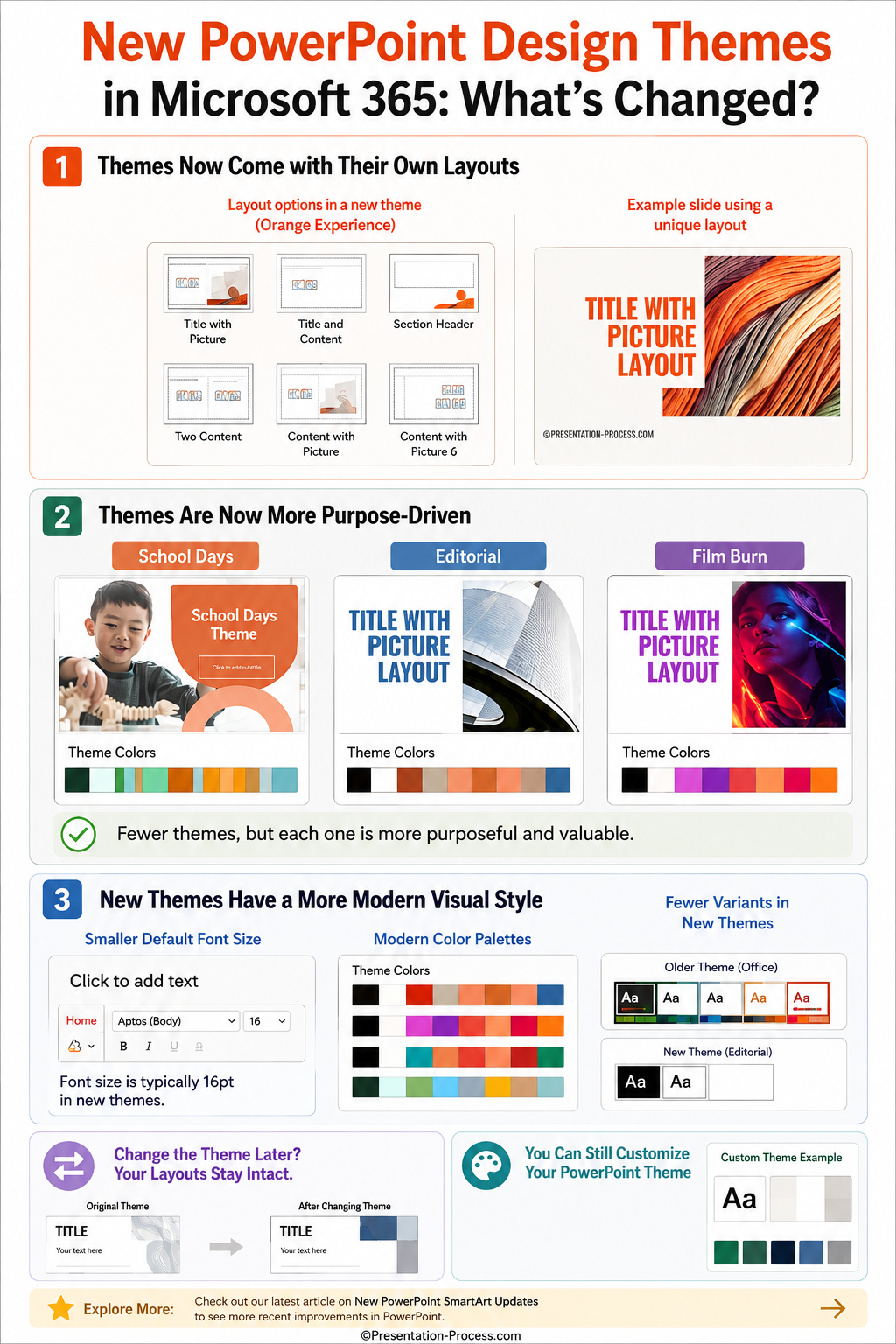
The Infographic below captures all the changes :
Final Thoughts
The changes to PowerPoint's Design Themes are more significant than they may initially appear.
The three biggest changes are:
- Themes now come with their own unique layouts.
- Themes are becoming more purpose-driven and designed for specific types of users.
- New themes have a more modern visual style, including updated typography and color palettes.
Overall, I think this is a welcome change. The newer themes feel more useful because they give you more than just a different set of colors and fonts. They can give you a better starting point for actually designing your slides.
If you use Microsoft PowerPoint for Microsoft 365, I recommend going to Design > Themes and exploring some of the newer options. More importantly, open the Layout menu after selecting a theme and see what new layouts are available.
You may find that a theme gives you a completely different way to build your slides.
Explore More Recent PowerPoint Updates
Microsoft continues to make regular improvements to PowerPoint. If you want to explore another recent update, take a look at our article on the new SmartArt features in PowerPoint, including the new SmartArt layouts and other improvements.