
Part of : 320+ Visual PowerPoint Graphs Pack
Widest Variety of Data-Driven Graphs & Infographics for PowerPoint
Conditional Iceberg Chart Showing Values Above Benchmark
 Description: This series contains a range of charts based on a condition. Based on the condition you set up, the data points that do not meet the condition are highlighted. For example performance as compared to the Median, compared to the average etc. Note that the average, median etc. are computed automatically based on the data you enter.
The slide is useful in reports and dashboards. Audience can get a quick view of the values you want to highlight.
Areas Above and Below Average Performance in Different Colors

Performance against the Average

Column Charts with Colors based on Defined Conditions

Survey Results on a 5 Point Scale with Colors based on Defined Conditions

Bar Chart with Values Less than Median Ticked

3D Chart with Positive Negative Values in Different Colors

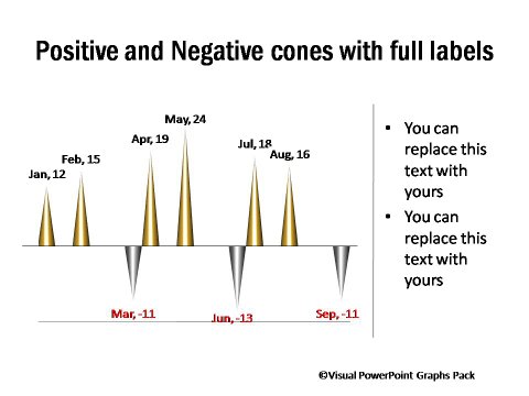
Cone Charts Direction Condition upon with Positive Negative Values
Related Templates from Graphs Pack:
|
|
|

