Home > All PowerPoint Tutorials > Infographics> PowerPoint Bubble Chart
Stylize PowerPoint Bubble Chart to improve the visual appeal of your slides. Discover ideas to use the chart in your newsletters and internal magazines.
Quick word about PowerPoint Bubble Chart:
A bubble chart shows relationship between 3 parameters. For example, you can use the chart to show relation between:
- Price, Sales Volume and Profit Percentage
- Page Rank of the website, Number of Visitors per day and Sales Volume
- Age of population, Body Mass Index and Percentage onset of Diabetes etc.
You can use the chart to conduct scenario analysis and help your audience make decisions on optimal tradeoffs. Here is what a typical chart looks like:

Why create Bubble Chart in PowerPoint?
Unlike other charts, Bubble chart requires extra effort in formatting. As a busy presenter, you can’t afford to waste too much time working on the look and feel of your data slides. Having pre-formatted chart templates in PowerPoint not only saves time, but also makes your slides look more professional.
Here are some quick ideas on improving the look and feel of Bubble charts in PowerPoint.
Use 3D when data points are fewer:
3D generally tends to make charts look complex. But, when data points are fewer, you can enhance the visual appeal of your slides by using 3D. Make sure to include clear data labels to avoid error in interpretation.
Take a look at the following PowerPoint Bubble Chart template for example:
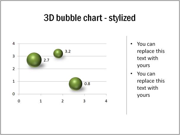
You can right click on the spheres, go to Format shape -> 3D Format and play with the material, lighting and shadow of the spheres to suit your needs.
Related: 5 Tips for Better Data Presentation
Play with Gradient fills where appropriate
When you use 3D spheres for bubbles, you can try different preset gradient fills to improve the look and feel of your charts. Take a look at this example:
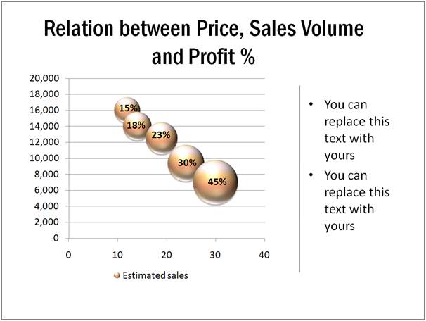
Source: Bubble chart Templates from Visual Graphs Pack
Strip off chart elements to give ‘Info graphics’ look to your bubble chart:
You can remove all unnecessary chart elements to give a ‘minimal’ look to your charts. Here is an example:
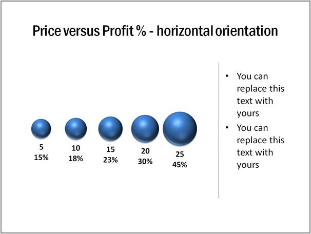 The advantage of the approach is – the chart fits in a small space and you get space to write text around the chart. So, the chart is quite useful to be included in a newsletter or internal magazine.
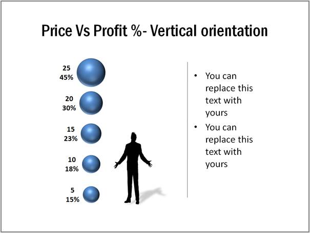
You can even add some interesting elements like silhouettes to improve the visual appeal. Here is an example of bubble chart with vertical orientation and a silhouette:
Add value with trend lines:
You can make your PowerPoint bubble chart more insightful by adding trend lines. Take a look at the following chart template:
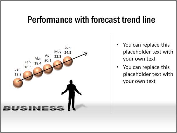
Source: Bubble Chart Templates from Visual Graphs Pack
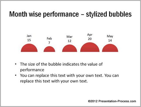
Experiment with shape of the bubble
Your bubbles need not always be circular. Here is a semicircular variation to make the chart look more interesting:
 Caveat:
Formatting bubble charts in PowerPoint requires a lot of time and skill. Most busy business presenters prefer to invest time on honing the content, rather than polishing the looks of the chart.
If you want your charts to look attractive but don’t want to waste time polishing them, we have an elegant solution for you. We recommend you take a look at our ‘Visual PowerPoint Graphs pack’.
The pack has more than 320 ready made Graph templates in PowerPoint. In fact, all the chart templates you saw in this article are taken from the pack.
All you need is to replace sample data with your own data. The pre-formatted templates will take care of the rest. Creating data slides has never been easier and quicker. Here are some more examples from the pack:
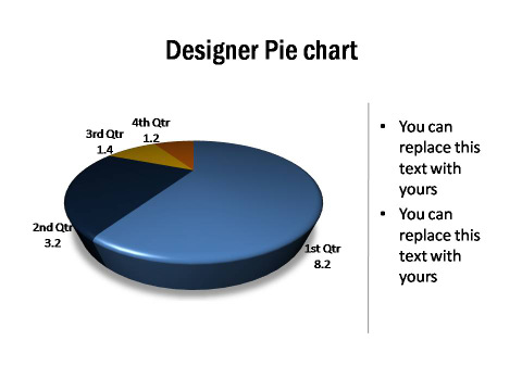
Source: PowerPoint Pie Chart Templates from Graphs Pack

Source: Percentage Completion Info Graphics from Graphs Pack
The pack has probably the widest collection of data driven templates for PowerPoint on the net. The templates are super easy to edit.
Why waste time building your data charts from the scratch, when you have such a high quality solution available off the shelf?
Related: Creative Variations of Column chart in PowerPoint
